



Full disclosure up top: this is one of ours, so we are going to be harder on it than a stranger would.
Frame 1 leads with "Never Run Out Of Words" over a real card, "What was your favorite cartoon or show?", and a hand holding a coffee. That is the right instinct, showing the product doing its actual job rather than a feature list. But look at the status bar: it reads "TestFlight". The lead screenshot, the one image every browsing customer sees, was captured from a beta build and shipped to the store without being retaken. It is a two minute fix and it undercuts the whole set, because it says nobody opened this listing at full size before publishing it. The same frame calls the app "Ice Breaker" in its own welcome text, while the store name is "Breaker"; pick one, because a customer who reads both wonders which app they just downloaded.
Frame 5 has a worse one. The screen is a Premium tab showing "Annual Plan - 1 days remaining", which is a real subscription about to expire, caught in a marketing asset. "1 days" is also ungrammatical. A screenshot whose job is to look finished is showing an account in a state no developer would choose to advertise.
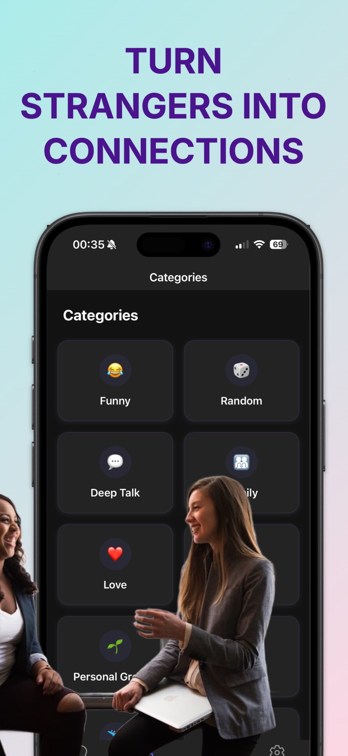
The headlines are strong. "Turn Strangers Into Connections" and "Stop Silences Forever" name the feeling rather than the feature, which most apps in this category get wrong. The category grid in frame 3 (Funny, Random, Deep Talk, Love) does real work too. The frames just need to be recaptured from a clean release build with a neutral status bar and a Premium state that is not one day from lapsing.
One thing done right, and it is the thing we happen to measure: Germany and Japan get their own screenshot sets rather than the English ones. Out of roughly forty listings we have looked at this month, that puts it in a group of about five.