


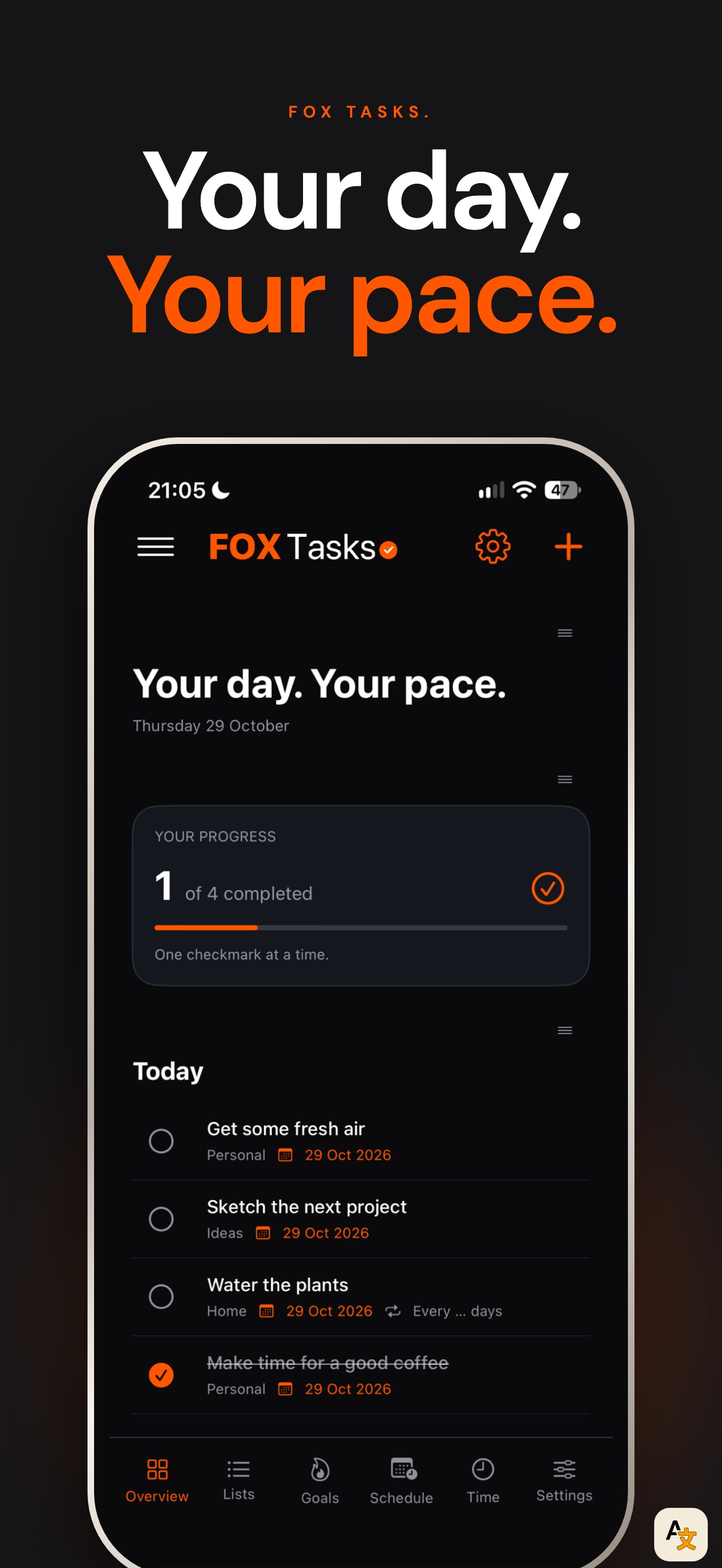
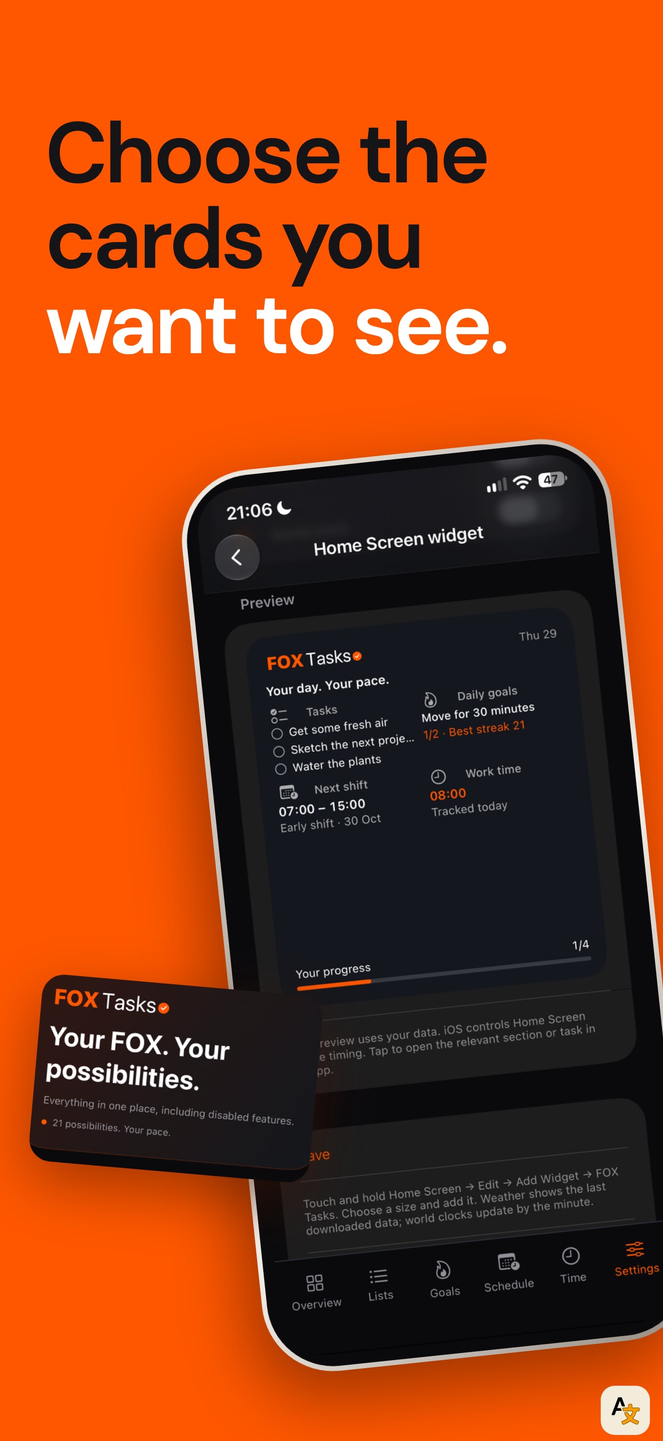
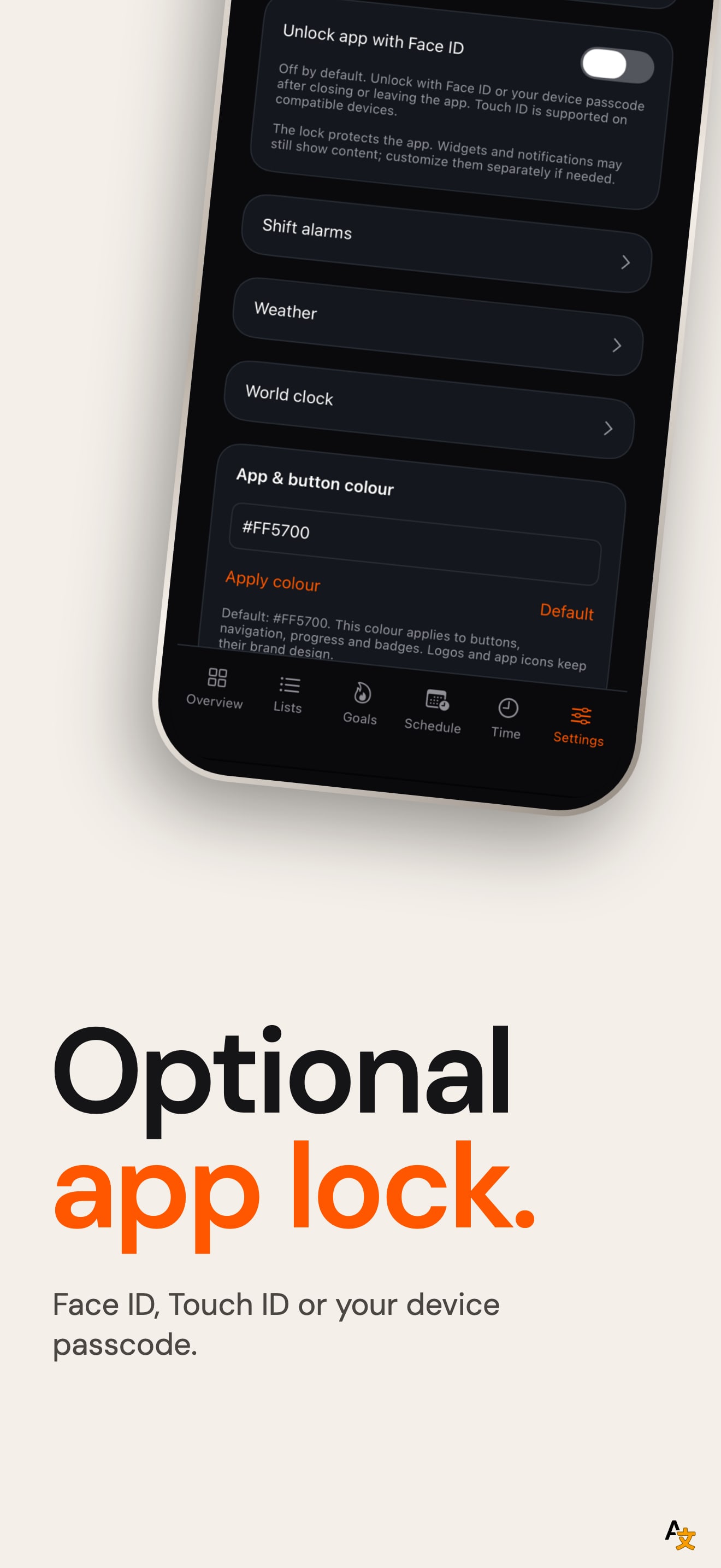
This set has a real system. Every one of the ten frames uses the same layout: a headline in two lines, the first in white and the second in orange, a small caption, a numbered counter in the corner and a phone below. The headlines also follow one pattern ("Your day. Your way.", "Your goals. On your wrist.", "Small steps. Your achievements."), so a shopper who scrolls the set feels the same voice from start to finish.
The first frame is the strongest: the Today screen with a progress card and four tasks is the planner doing its job. After that the screens turn into settings pages. Frames four to nine show Personal text, Navigation, Customise overview and All features, which sell how configurable the app is but do not show a planner someone would want to use. Ten frames also means most shoppers never get past the first three.
On localization, we compared the first screenshot across the US, DE, JP, ES, FR, IT, PT, TR and SA storefronts. German, Japanese, French and Spanish each have their own headline and translated screen. Italian and Portuguese show the German frame, the same file as the German storefront, and Turkish and Saudi show the English frame. The listing declares English, French, German, Japanese and Spanish, so the Italian and Portuguese shopper gets German text.
The one fix that matters: cut to five frames and replace the settings screens with the Goals streak and the Apple Watch frame, which are the features the description leads with.