

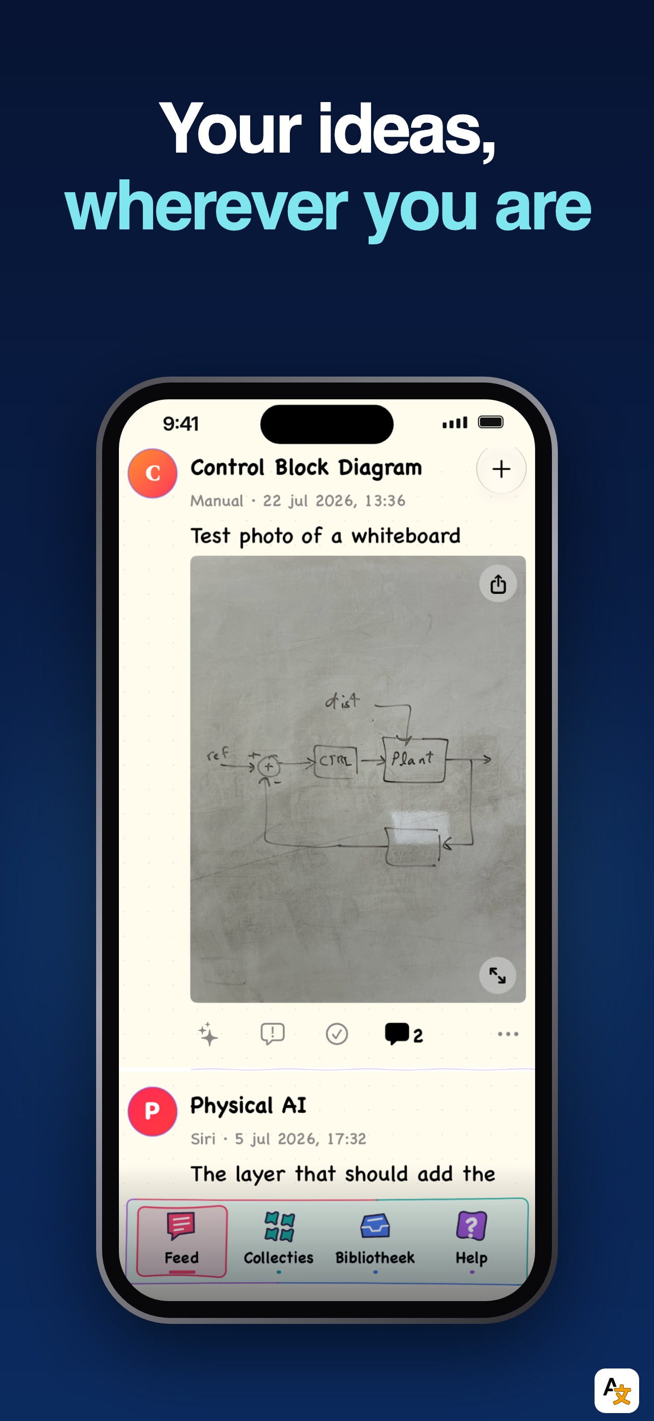
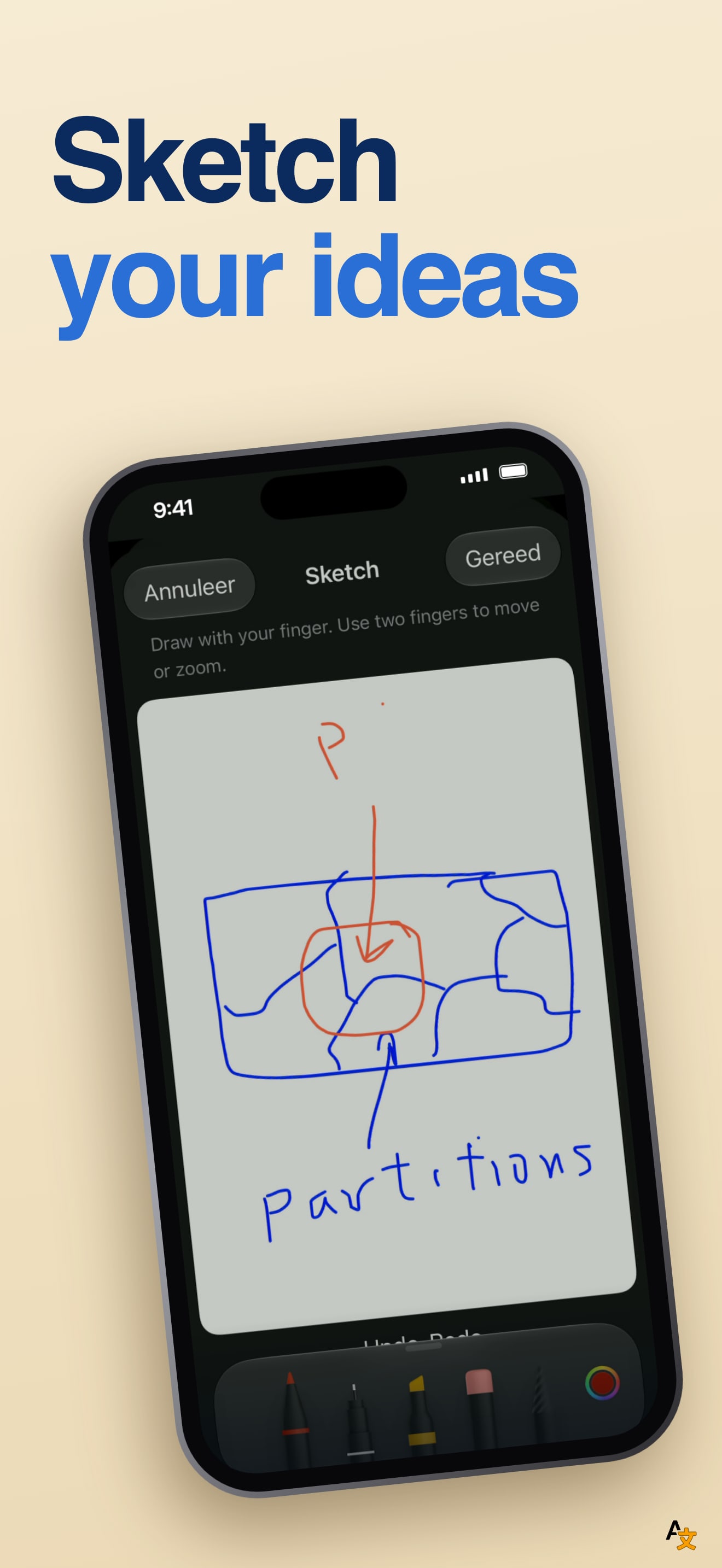
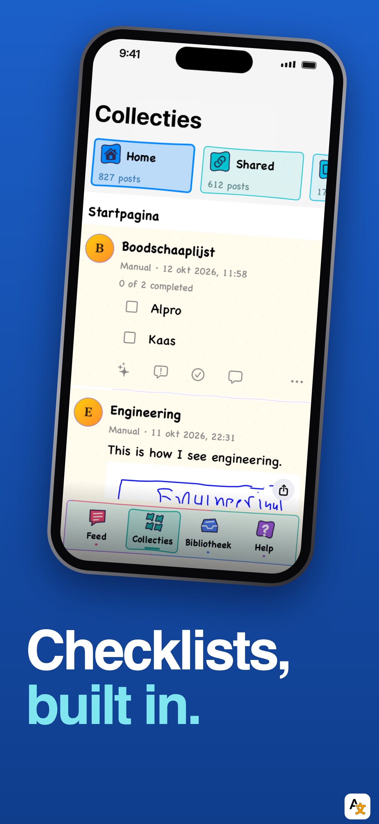
The look is cohesive: a dark navy ground, a big two lines headline with the first line in white and the second in blue, one short sub line, and a phone below it. The first six frames read as one set, and the big type survives thumbnail size.
The first frame is the weak slot. "Your ideas, wherever you are" sits over a photo of a woman on a train with a very small phone inside the photo. The phone screen is too small to read, so the first thing a shopper sees says "ideas" and "private feed" but shows no product. Frame two, "Scroll your own ideas", has the app name in its title and the real feed filling the phone. That is the frame that explains the product, and it is second.
Frames three to six each carry a "NEW IN 6.0" pill: Sketch, Word clouds, Colorful mode, Checklists. That is a changelog, and four of the first six slots go to it. A first-time shopper does not know what version 5 was, so the pill tells them nothing and the slots could instead show capture (links, photos, files) and the resurfacing of old ideas, which is what the description leads with.
One detail a shopper will spot: the phone screens inside frames three to six show Dutch interface text, for example "Annuleer", "Gereed" and "Collecties", under English headlines. The app declares eight languages, so the screenshots were captured in a non-English device language.
On localization, we compared the first screenshot across the US, DE, JP, ES, FR, IT, PT, TR and SA storefronts. It is the same file in all nine, nine frames in total, while the app itself supports Arabic, Dutch, French, German, Japanese, Spanish and Chinese besides English. Those storefronts see English captions over a Dutch UI.
The one fix that matters: lead with the feed. Make "Scroll your own ideas" frame one, retake the phone screens with the device in English, and translate that first frame for the languages the app already speaks.