

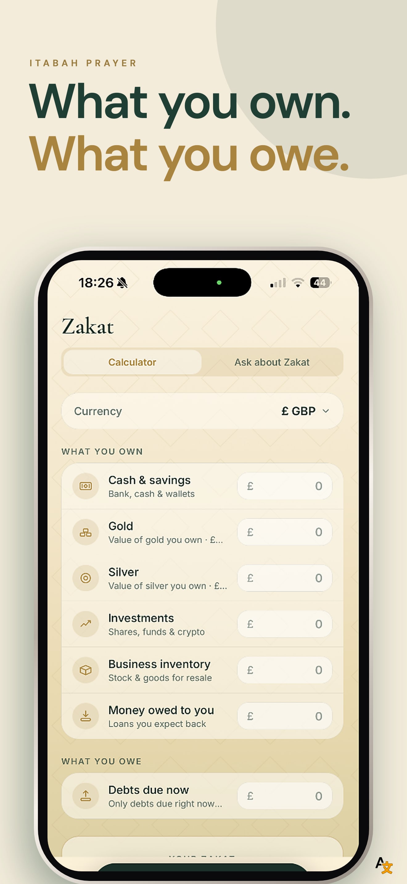
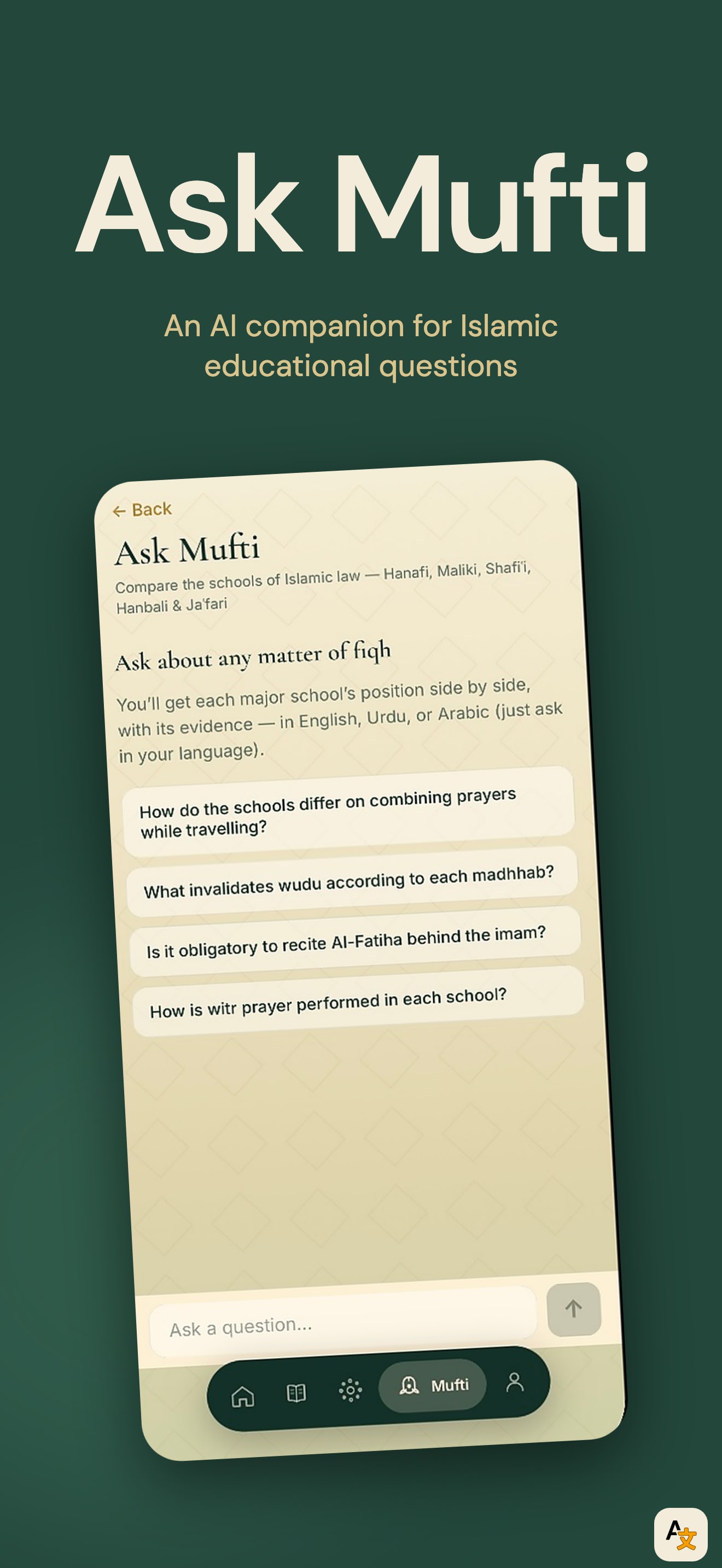
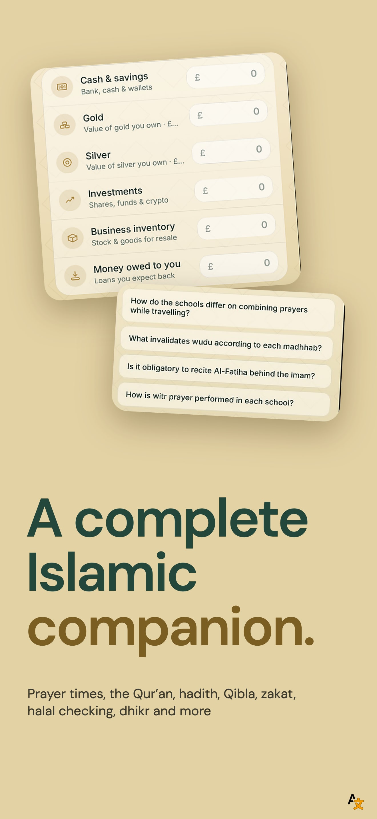
The look is distinctive. A cream ground, a bold sans headline set against an italic serif, and a dark green block give the set a calm, printed feel that is easy to tell apart from a standard app screenshot. Every frame uses the same pairing of the two typefaces, so the four read as one system.
The first frame carries three separate messages: "prayer times never miss a prayer", "Adhan right when I need it" and "Daily Dua Reminder". The tilted phone is cut off by the frame edge and the Home screen on it is small, so at thumbnail size only the headline is readable. The second frame has no phone at all: it is a dark green card with a headline and a paragraph. That is one of only four slots spent on text, and the paragraph is too small to read in search.
The listing description names prayer times, the Qur'an, hadith, Qibla, zakat, halal checking and dhikr. The screenshots show prayer times, the Zakat calculator and Ask Mufti. The Qur'an, the second feature the description lists, never appears in a frame.
On localization, we compared the first screenshot across the US, DE, JP, ES, FR, IT, PT, TR and SA storefronts. It is the same file in all nine and the listing declares English only. For an app whose users read Arabic and Urdu, that is the largest open gap.
The one fix that matters: replace the text-only second frame with the Qur'an reader on a device, and keep one message per frame.