


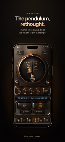

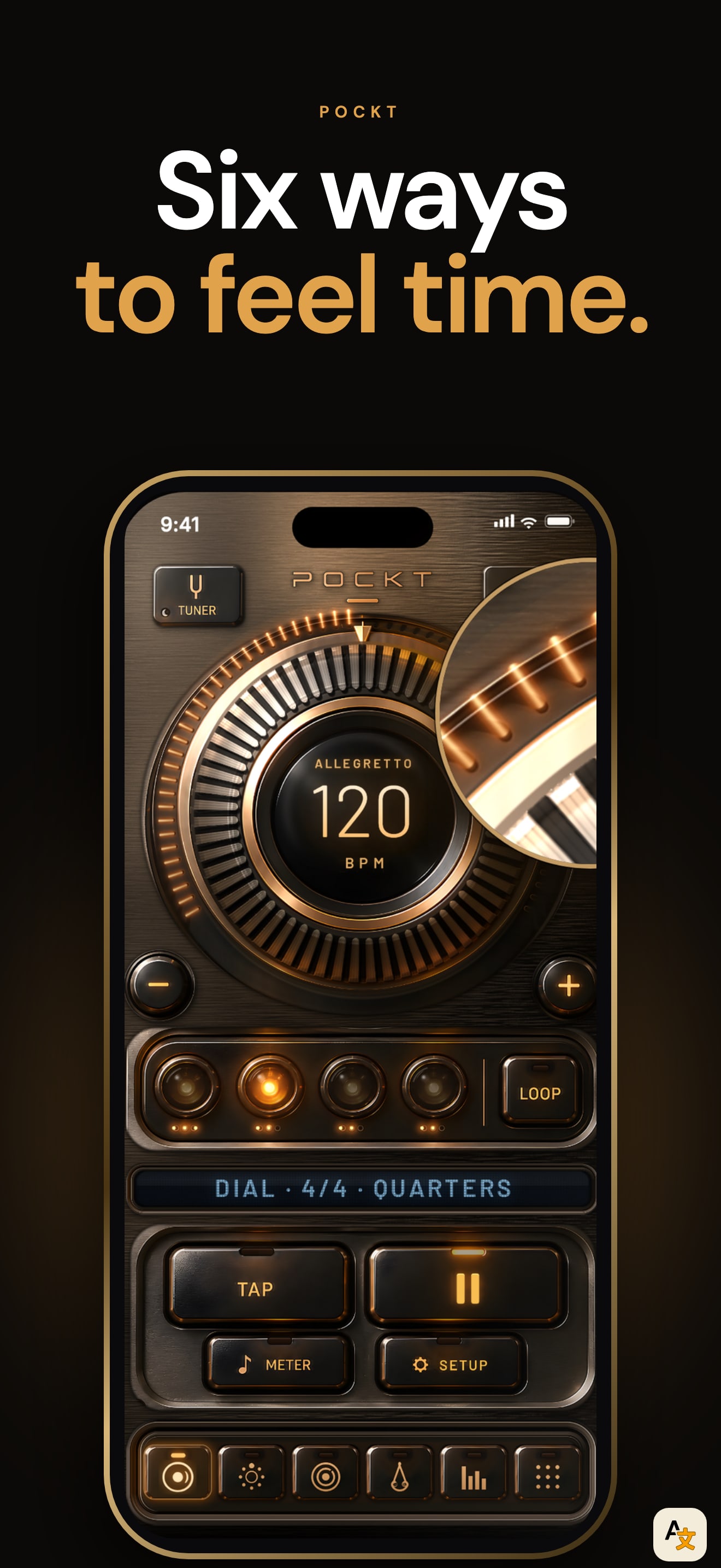
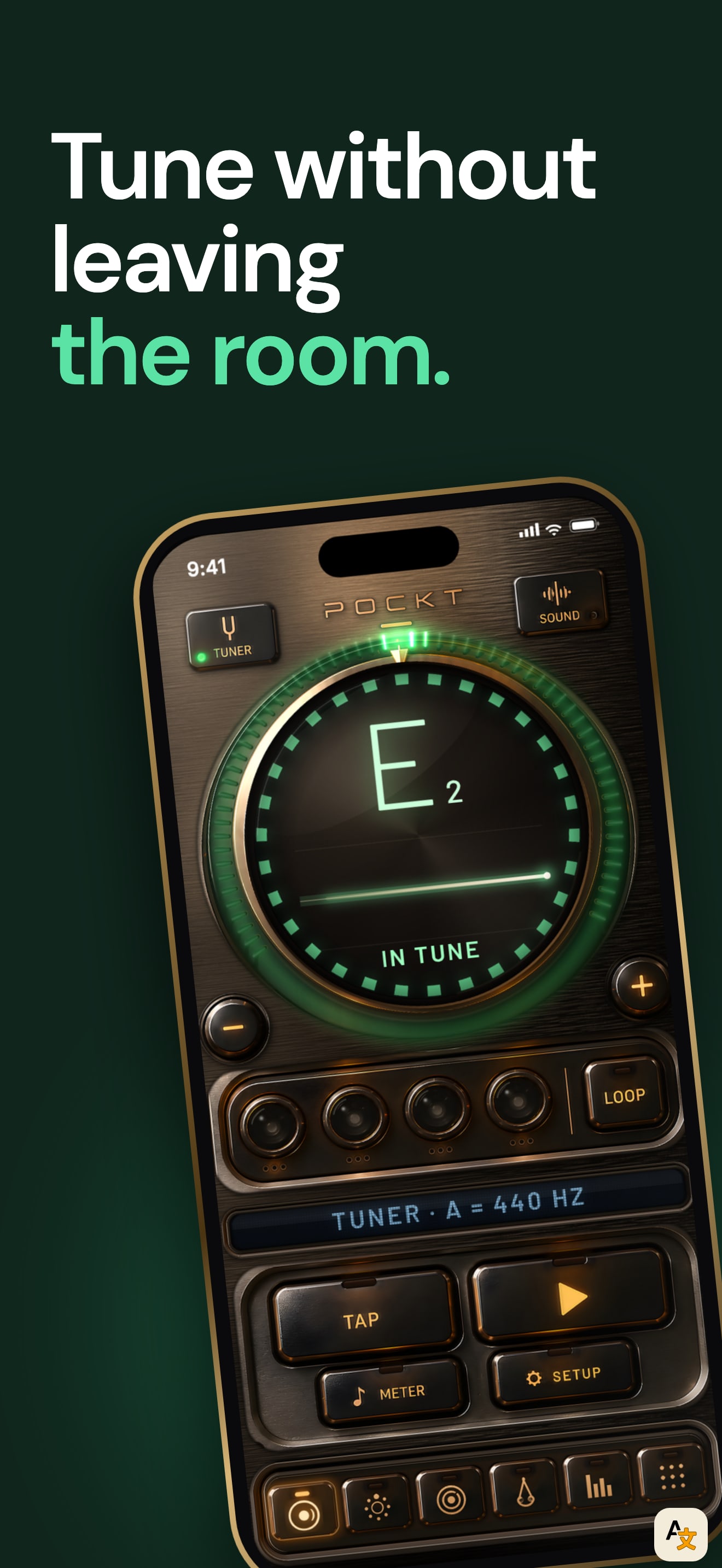
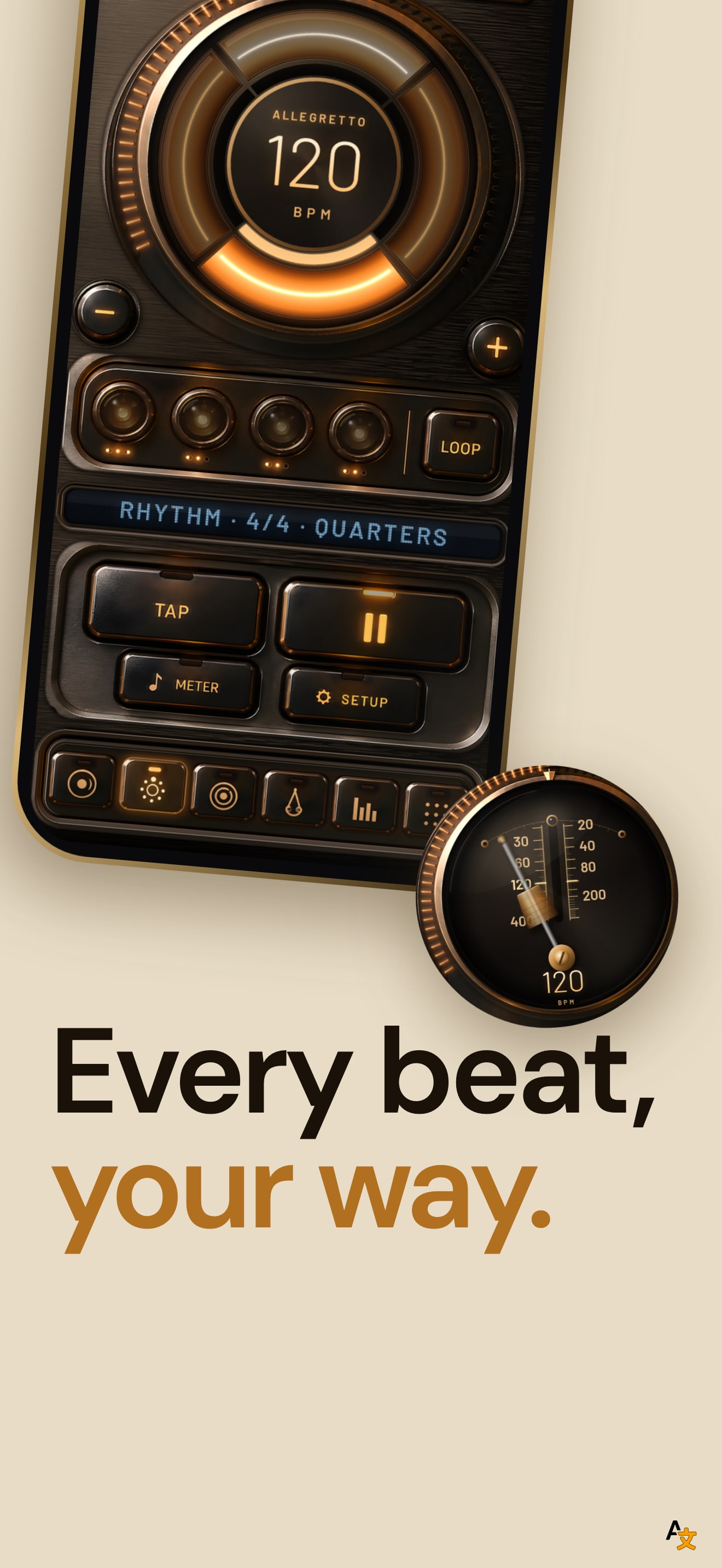
The set has one strong idea and keeps to it. All ten frames sit on the same near black ground with brass and light on the phone, a small spaced caption above the headline (DIAL, PULSE, PENDULUM, RHYTHM, PRO, SOUND, TUNER) and the line "Find Your Pocket." at the bottom. The headline is two lines with a warm accent on the second ("Six ways to feel time.", "A classic metronome, refined.", "See time in motion."), so the app looks like one instrument, not a utility.
The structure follows the product. The first frame shows three phones at once to say "six ways", frames two to six show one face each (Dial, Pulse, Pendulum, Rhythm, Pro) with the same phone in the same place, so a shopper who swipes sees the faces change while the frame stays put. Frame two adds a magnified crop of the dial ring as a second element. Frames seven and eight cover sound and the tuner.
Frame nine turns a number into the headline: "0.2 ms" for beat to beat timing, and the listing description backs it with its own measurement (0.02 ms median, 0.09 ms at the 99th percentile over 364 intervals). The last frame is the app icon and "No ads. No subscriptions. No tracking.", the promise the description closes on. It is the only frame with no phone.
The gap is the looper. The description lists a six layer looper and a speed trainer; they appear only as small pills on the last frame and never on a device. For a musician comparing metronomes, those two features are what separates this app from the free ones.
On localization, we compared the first screenshot across the US, JP, TR and SA storefronts, the ones where the app is listed. It is the same file in all four and the listing declares English only. The one fix that matters: replace one of the five face frames with a looper screen, since the five faces already tell the same story.