


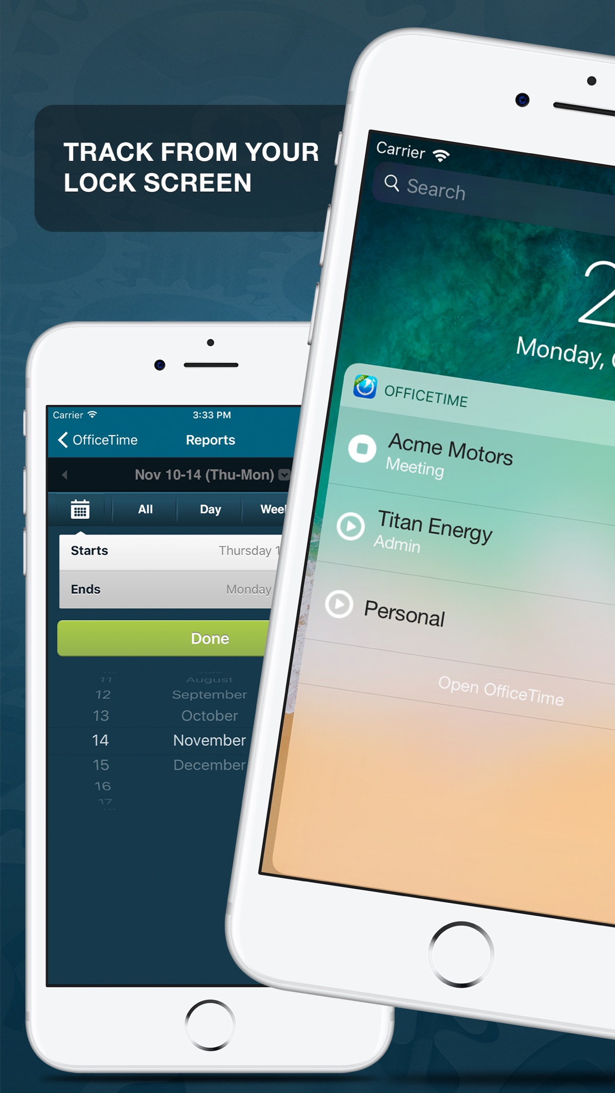

Full disclosure: the developer asked us to run this now rather than wait, so this is a teardown of the listing as it stands today, with a redesign already in progress. Read it as a before.
OfficeTime has been on the App Store since 24 August 2011, which is the single most valuable fact about it and appears nowhere in the screenshots. Fifteen years of shipping a time tracker is a trust signal almost nobody in this category can claim, and the listing spends its first frame on something else entirely.
That first frame is showing an interface from an iOS generation that ended years ago: the flat teal chrome, the beveled list rows, the gradient buttons. Anyone comparing time trackers reads that as abandoned before they read a word of the description, which is exactly backwards for the app that has outlasted everyone. The status bar also reads "Carrier", the simulator placeholder, so the lead image was captured from a build running in Xcode rather than a real phone.
The awards underneath are real and worth keeping: PC Mag Editors' Choice and Tap! do not hand those out lightly. But they carry no year. An award with a date next to it reads as a record; an award without one raises the same question the old chrome does, which is whether any of this is current.
So the fix and the strength are the same thing. The redesign handles the interface. The copy should put the fifteen years and the dated awards where the abandonment worry currently sits, and turn the oldest thing about the app into the reason to trust it.
One measurement, since it is what we do: the app ships in one language and so do the screenshots, identical English frames in every storefront we checked. For an English-only app that is fine, and it is the least of the things worth fixing here.