


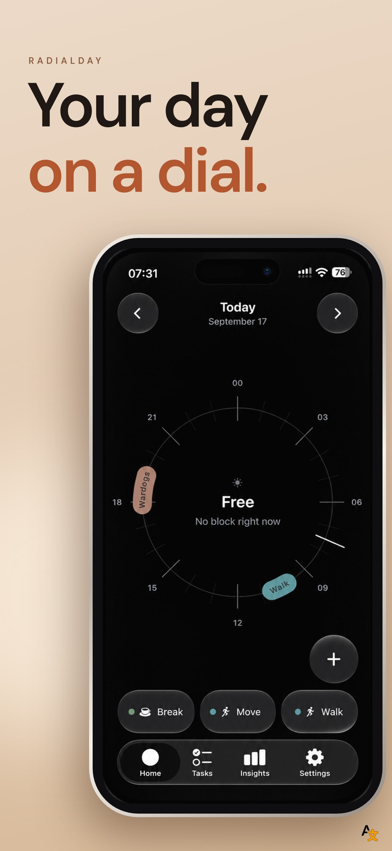
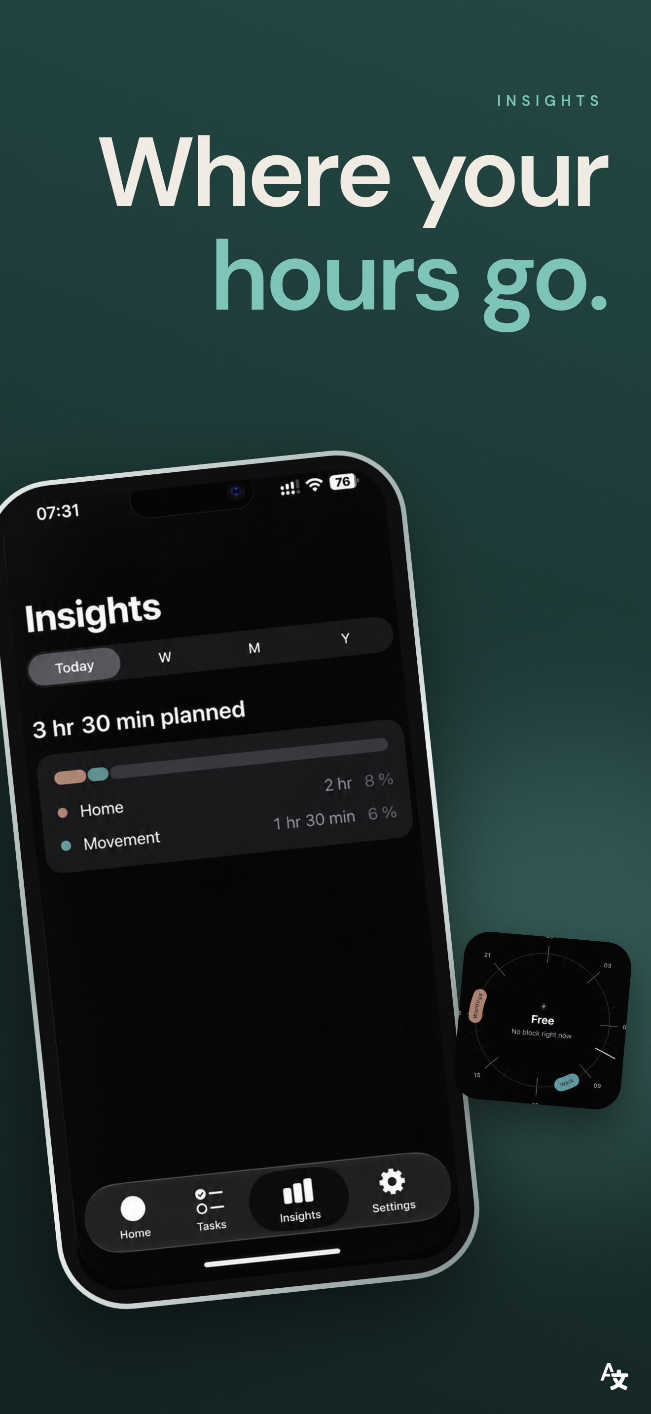
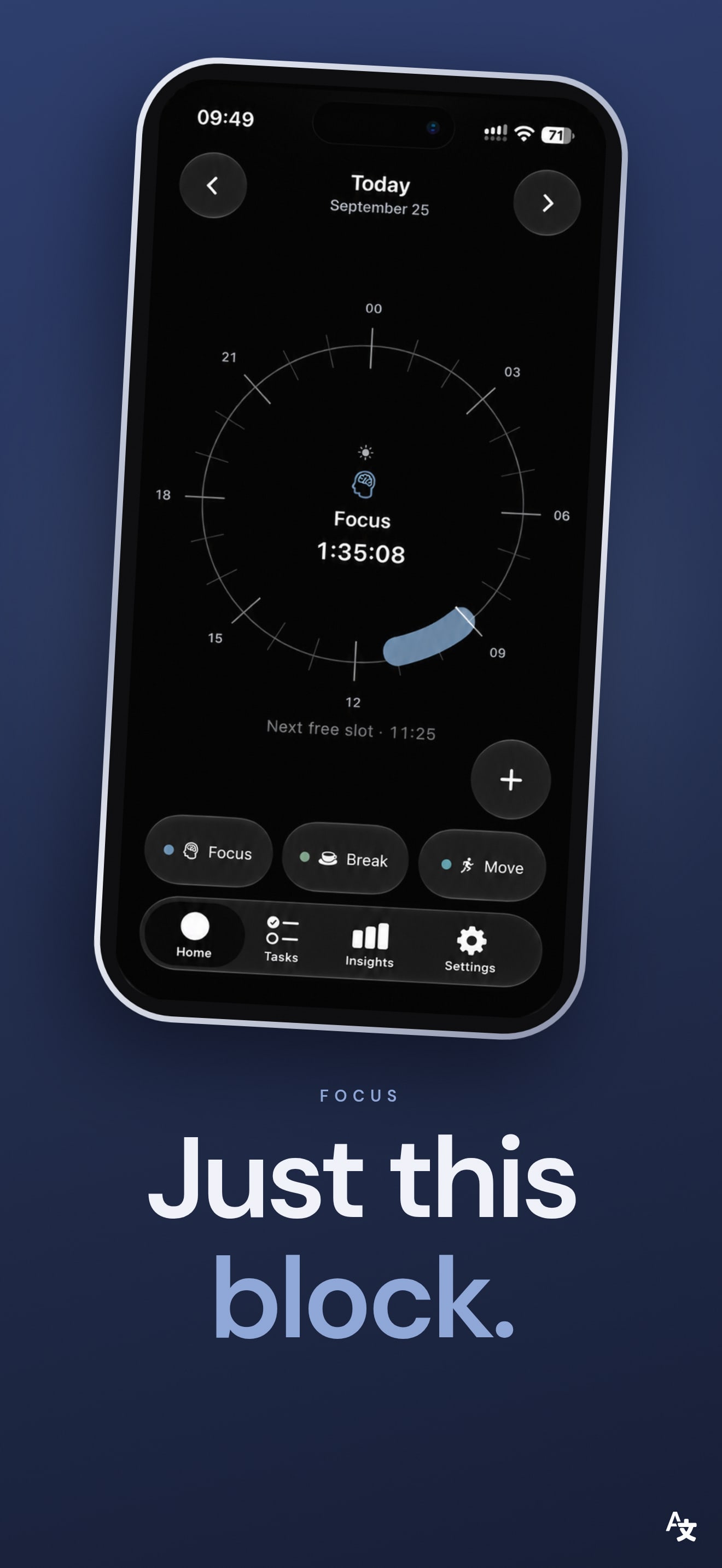
The idea is the strongest thing here, and the first frame shows it. "Your day on a dial." is short, the black ground with a single 24-hour circle is unlike every other planner in the results, and you understand the product from the picture alone.
What holds it back is what the dial shows. The hero state is "Free, no block right now" with two small blocks on a mostly empty ring. A planner sells by showing a full, believable day, so the first frame should show the dial packed with real blocks. The headline also names the format but not the benefit; "see where your day goes" would say why a dial beats a list.
On localization, we compared the first screenshot across the US, DE, JP, ES, FR, IT, PT, TR and SA storefronts. The listing supports English and German only. The US, Turkish and Saudi storefronts show the English frame. The German, Spanish, French, Italian, Japanese and Portuguese storefronts all show the German frame, "Dein Tag auf dem Dial.", with a German UI. For a Spanish, French or Japanese shopper that is a screenshot in a language they may not read, and it is the default they get.
The one fix that matters: make the dial show a full day in the first frame. If the budget allows a second change, set the screenshots for the other storefronts to the English set, or localize them, so the German frame is not the fallback for half the world.