

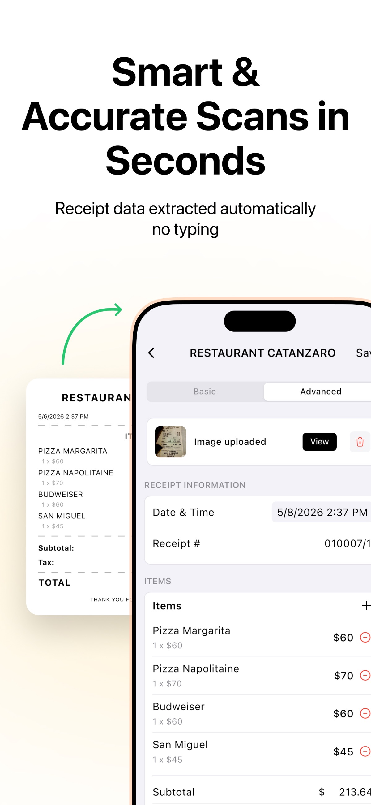


Frame 1 has the right idea and then quietly argues against itself.
Putting the paper receipt beside the parsed line items is exactly the structure this app should lead with: the before and the after in one glance, no explanation needed. Two things undo it.
The first is the crop. The receipt is cut off at the left edge of the frame and the phone is cut off at the right, so the nav button reads "Sav", the receipt number reads "010007/1", and the merchant name on the paper reads "RESTAURAN". The before and the after both run off the picture. The same crop repeats in frames 2, 3 and 5.
The second is harder to unsee. The paper receipt is dated 5/6/2026 2:37 PM. The Date and Time the app has extracted from it, sitting a few centimetres to the right in the same image, reads 5/8/2026 2:37 PM. Same minute, two days apart. The headline above both of them says "Smart and Accurate Scans in Seconds". It is almost certainly a mocked up asset rather than a real extraction bug, but the one frame whose job is to prove accuracy is the frame showing a value that does not match its own source. While you are in there: the paper receipt's Subtotal, Tax and TOTAL rows are printed with no amounts next to them, so the before half of the comparison has no numbers in it at all.
Frame 8 is the one we would move. It carries the app name, a Trustpilot score, and a real hand holding a phone over a real crumpled receipt on a table. It is the only frame with a human in it and the only one that looks photographed rather than rendered, and it is last.
Then there is frame 7, which says "150+ currencies, 30+ languages". We checked the American, German, Japanese, Turkish and Saudi storefronts and all five serve that identical English frame. The image advertising thirty languages is itself available in one.
Credit where it is due: 8 of the 10 slots filled is more than most apps manage, and the run from scanning to export to analytics is a real sequence rather than eight views of the same list.