


Sprout looks calm and careful, which matters for an app about anxiety and mood. Every frame follows the same layout: a short rule, a headline of a few words, a plain sentence under it, and the screen below without a phone body around it. Frame one shows the home screen: "Good afternoon, Mia", a check-in card asking "You felt good earlier. Anything changed?", today's practices with 2 of 3 done, and a week of moods.
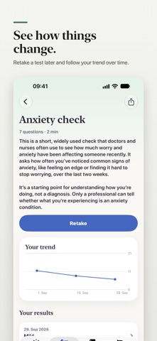
The first headline undersells the app. "Notice how you feel." is a mood check-in promise, the kind a plain mood journal could also make. Your own description opens with something else, "Take a test. Understand the result. Find what helps.", and says Sprout has 50 psychology tests. The tests only appear from frame two, "Wellbeing tests, in plain words.", and the screen that explains an anxiety result in everyday language is frame four. A shopper who stops at the first frame takes Sprout for one more mood journal.
On localization, we looked the app up in the US, DE, JP, ES, FR, IT, PT, TR and SA storefronts. It is listed in all nine with the same English first screenshot, and the listing declares English only. So for now the question is the screenshots themselves, not translation.
The one fix that matters: lead with the tests. Put frame two first, or give frame one the opener of your own description, "Take a test. Understand the result.", over the tests screen. The check-in and the week of moods can follow as the reason to come back.