


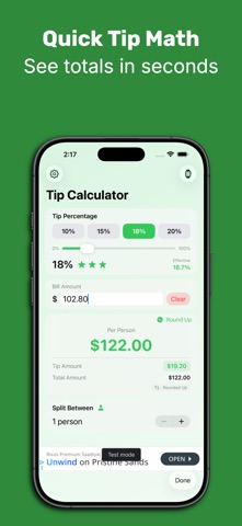

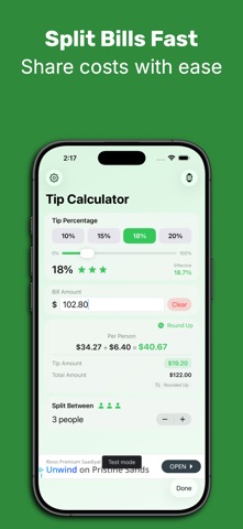

This tip calculator opens with a strong value proposition, highlighting Apple Watch support with a clean visual that shows both devices working together. The interface is polished and the green branding creates good visual consistency across frames.
However, the listing has several problems that undermine its professionalism. Every screenshot shows "Test mode" in the bottom left corner, a debug element that signals an unfinished build to potential users. This appears in frames 1, 2, 4, and 5, making it impossible to miss.
The screenshots also waste precious real estate through repetition. Frames 2, 4, and 5 show nearly identical iPhone screens with only minor differences in the split count (1 person vs 3 people). At listing thumbnail size, these read as the same screenshot shown multiple times, squandering opportunities to showcase different features.
Frame 3 stands out as the strongest, focusing solely on the Apple Watch interface without debug artifacts. The one change worth making: remove the test mode indicators and diversify the iPhone screenshots to show distinct features rather than subtle variations of the same calculation screen.