




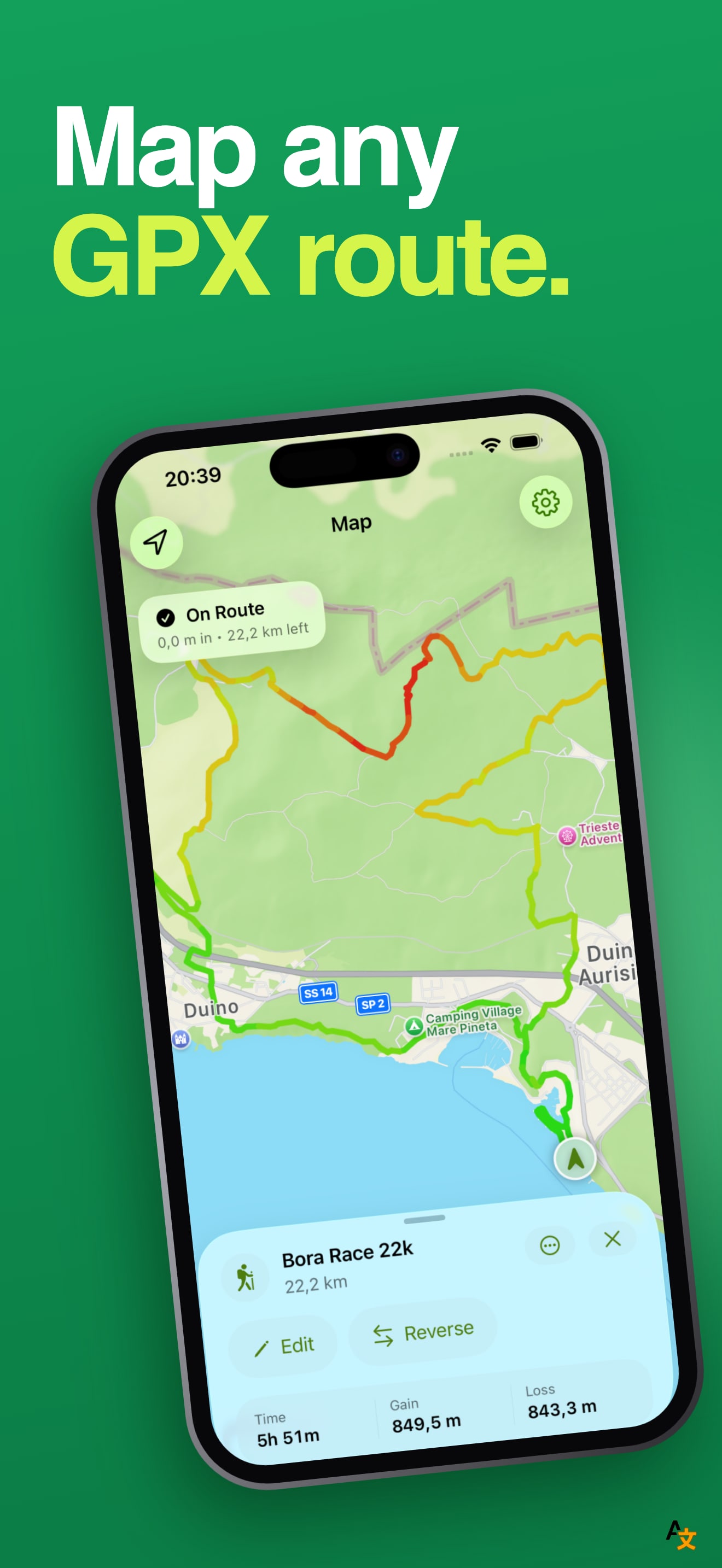
The developer asked two things: is it obvious that the app opens GPX files, and should the first frame show a real route with its elevation profile instead of one feature per slide. On the first question, yes. "Map Any GPX Route" is the first thing you read, in white on a green ground, over two lines, and the word GPX is in it. A shopper who already has a GPX file knows this is for them.
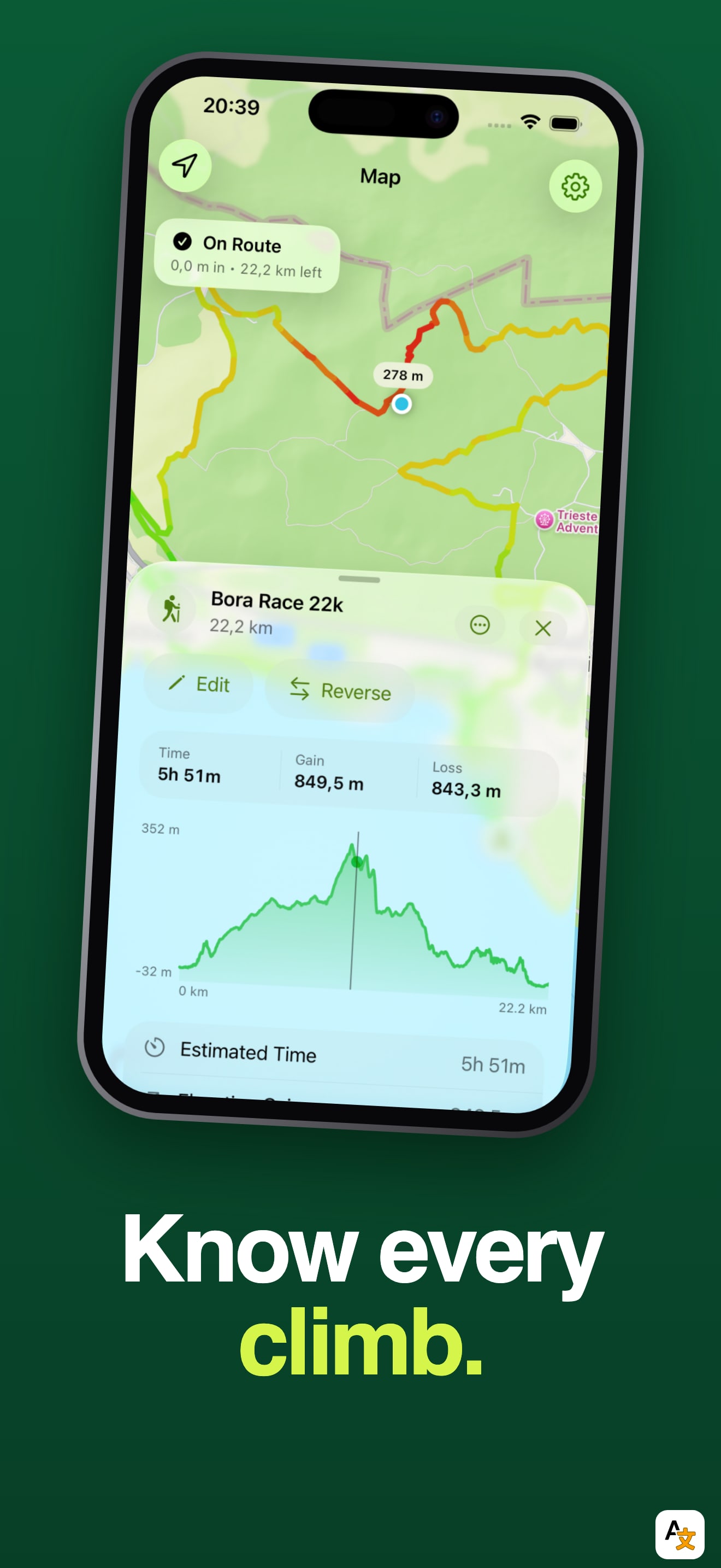
The second question is where the set leaves value on the table. Frame one shows a finished route on the map with a route card at the bottom (Bora Race 22k, 5h 51m, 849,5 m gain). The strongest screen in the app is frame four, "Know Every Climb": a real elevation profile with the time, gain and loss above it. It is the one screen that looks like nothing else in a row of search results, and it sits fourth.
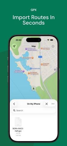
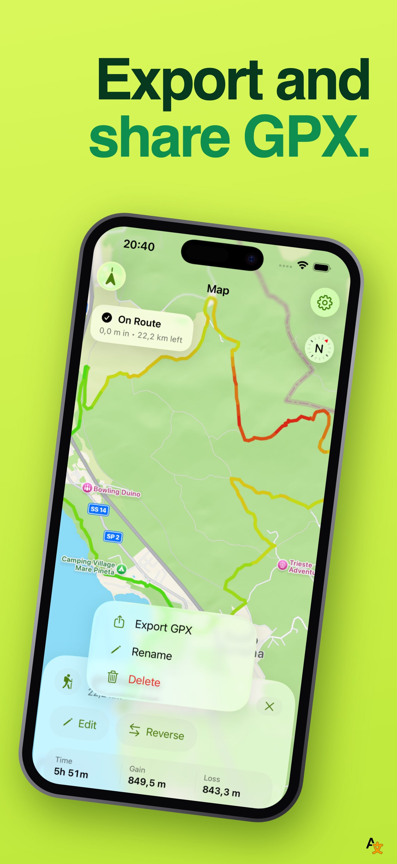
The rest of the set is consistent and readable. Frames two and six put the headline under the phone and the others put it above, which gives the scroll some rhythm. Frame three, "Import Routes In Seconds", shows the iPhone file picker with one tiny GPX file icon; it explains how to import, but a sheet with one small file icon is a quiet frame in a green set. One small label reading "GPX" above that headline repeats what the first frame already said.
On localization, we compared the first screenshot across the US, DE, JP, ES, FR, IT, PT, TR and SA storefronts. It is the same English set in all nine, and the listing declares English only, so that is consistent. A route app is useful in every country that hikes, and the headlines are three or four words each, which makes translation a small job.
The one fix that matters: put the elevation profile frame first, or build a new first frame with the route and its profile together under "Know Every Climb". That answers "what do I get that a plain GPX viewer does not give me" before the shopper has to scroll.