


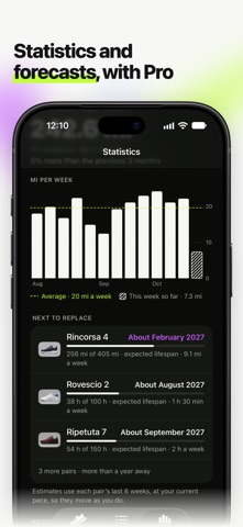
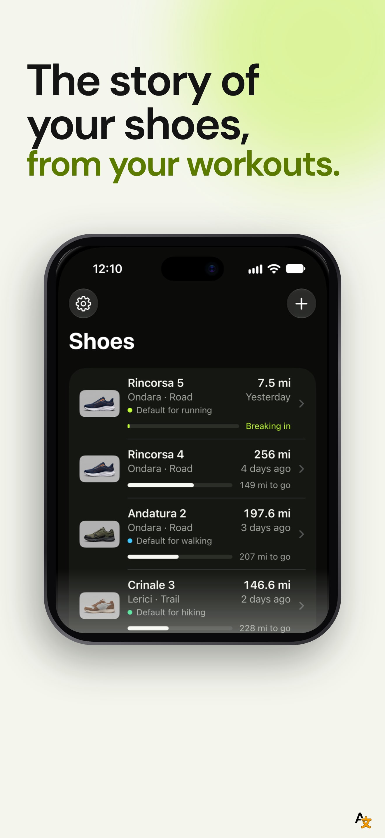
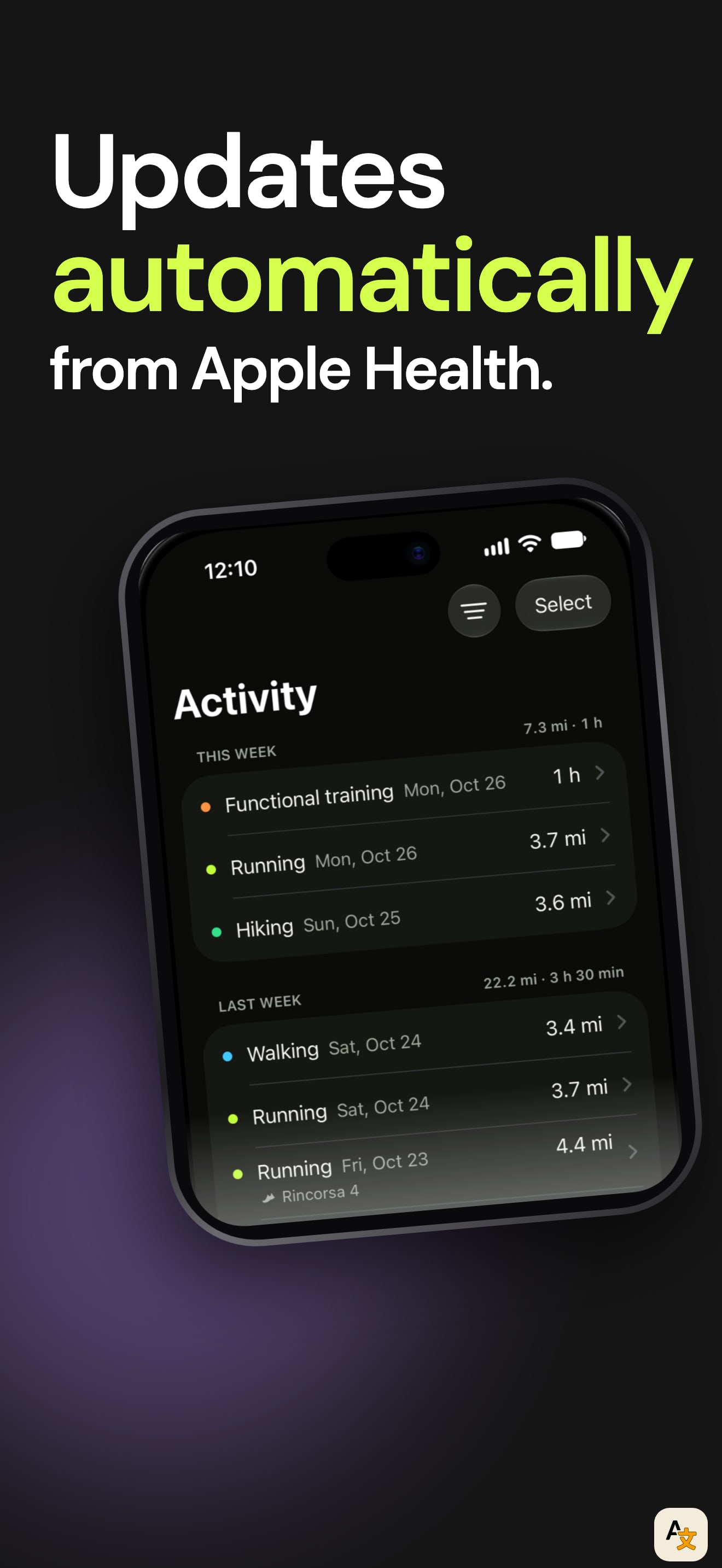
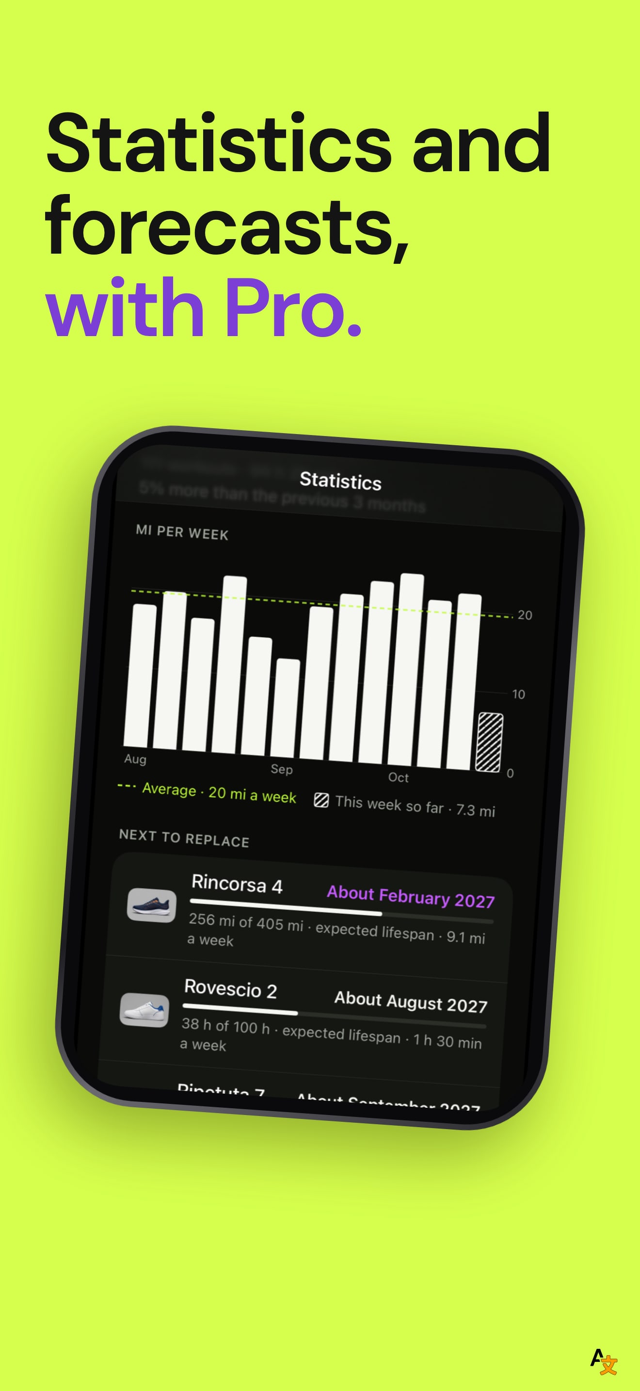
The set has a clear sequence. The six frames go from the promise ("The story of your shoes, from your workouts") to how the data arrives ("Updates automatically from Apple Health"), the shoe list, the Home Screen widget, the statistics and finally the privacy line "No account. Your data stays yours." Each headline is short and sits above a phone in the same place, and in every frame one key word carries a highlighter style marker, so the six read as one system.
The first frame is the strongest one: a single pair, Rincorsa 5, with the distance, the lifespan left and a "Breaking in" note shows the whole idea in one screen. Frame four is the most useful for a shopper, because it shows that the app has a widget and "no app to open". The weak spot is frame five: the top of the phone fades out over the statistics title, so the headline number is unreadable and the chart is the only thing a viewer can read.
The listing description also names Lock Screen widgets, hours for gym, HIIT, tennis and basketball, and a default pair per activity. None of these appears in a frame, so the set sells the tracker but not the extra depth.
On localization, we compared the first screenshot across the US, DE, JP, ES, FR, IT, PT, TR and SA storefronts. German, Japanese, Spanish, French, Italian and Portuguese each get a translated headline and a translated phone with kilometres instead of miles, which is thorough work. The Turkish and Saudi storefronts still show the English frame, and the listing declares Arabic.
The one fix that matters: show the Lock Screen widget or the hours based activities in place of the plain pairs list, so the second half of the set shows something the first half did not.