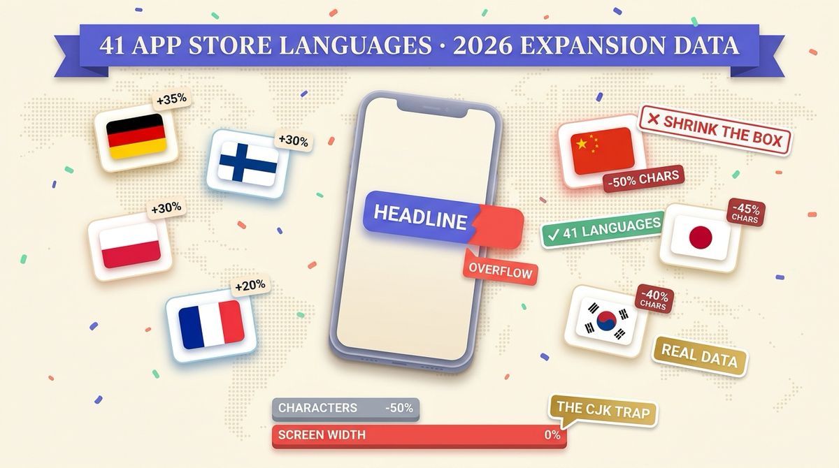
Translate a screenshot headline into German and it gets about 35% longer. Translate the same headline into Chinese and the character count drops by half. Most localization advice stops there, and that is where screenshot layouts break, because character count is not what overflows a button. Visual width is.
Below is the full expansion table for all 41 languages the App Store accepts, taken from the dataset Shotlingo uses to auto-fit translated text into screenshot layouts. It carries two numbers per language, not one: how much the text length moves against English, and how much the rendered width moves. For most European languages those two numbers are identical. For Chinese, Japanese and Korean they are 45 to 50 points apart, and that gap is the single most expensive misunderstanding in localized screenshot design.
Why this is a different problem from App Store character limits
There are two expansion problems in app localization and they are easy to confuse.
The first is metadata truncation: your app name, subtitle and promotional text have hard character limits, and a translated string that exceeds them gets cut off in the store listing. We covered that one separately in App Store localization character limit overflow.
The second is layout overflow, which is what this post is about. Nothing truncates your screenshot headline. It simply runs past the edge of the button it was centered in, wraps onto a third line that collides with the device mockup, or gets auto shrunk to a font size nobody can read on a phone-sized thumbnail. No validator catches it. It ships, and it ships in the locale you personally cannot proofread.
Text expansion for all 41 App Store languages
Percentages are relative to the English source string. Text length is the character count multiplier. Visual width is how much horizontal space the rendered string actually takes, which is the number that decides whether your layout survives.
| Language | Text length vs English | Visual width vs English |
|---|---|---|
| German (de) | +35% | +35% |
| Finnish (fi) | +30% | +30% |
| Hungarian (hu) | +30% | +30% |
| Polish (pl) | +30% | +30% |
| Portuguese (Brazil) (pt-BR) | +30% | +30% |
| Portuguese (Portugal) (pt-PT) | +30% | +30% |
| Arabic (ar) | +25% | +30% |
| Croatian (hr) | +25% | +25% |
| Czech (cs) | +25% | +25% |
| Estonian (et) | +25% | +25% |
| Lithuanian (lt) | +25% | +25% |
| Persian (Farsi) (fa) | +25% | +30% |
| Serbian (sr) | +25% | +25% |
| Slovak (sk) | +25% | +25% |
| Slovenian (sl) | +25% | +25% |
| Spanish (es) | +25% | +25% |
| Swedish (sv) | +25% | +25% |
| Bulgarian (bg) | +20% | +20% |
| Catalan (ca) | +20% | +20% |
| Danish (da) | +20% | +20% |
| Dutch (nl) | +20% | +20% |
| French (fr) | +20% | +20% |
| Greek (el) | +20% | +20% |
| Italian (it) | +20% | +20% |
| Latvian (lv) | +20% | +20% |
| Norwegian (no) | +20% | +20% |
| Romanian (ro) | +20% | +20% |
| Turkish (tr) | +20% | +20% |
| Ukrainian (uk) | +20% | +20% |
| Urdu (ur) | +20% | +30% |
| Vietnamese (vi) | +20% | +20% |
| Indonesian (id) | +15% | +15% |
| Malay (ms) | +15% | +15% |
| Russian (ru) | +15% | +15% |
| Hindi (hi) | +10% | +15% |
| Hebrew (he) | 0% | +5% |
| Thai (th) | -5% | 0% |
| Korean (ko) | -40% | +5% |
| Japanese (ja) | -45% | +5% |
| Chinese (Simplified) (zh-Hans) | -50% | 0% |
| Chinese (Traditional) (zh-Hant) | -50% | 0% |
Three things fall out of the full table that a top-ten list would hide.
31 of 41 languages run at least 20% longer than English. Expansion is not an edge case you handle for German and forget. It is the default behavior of three quarters of the store's languages, and a layout that only has slack for 10% is under-built for most of the world.
Only 5 languages produce shorter text (Thai, Korean, Japanese, and both Chinese scripts). Hebrew comes out even. Everything else is longer.
Five languages tie at +30%: Finnish, Hungarian, Polish, Portuguese (Brazil) and Portuguese (Portugal). German leads at +35%. If you want one stress test that covers the realistic worst case, design the layout in German and check it in Finnish.
The CJK trap: half the characters, the same width
This is the row of the table people get wrong, and it is worth stating plainly.
Chinese Simplified runs 50% shorter in characters and 0% narrower on screen. Japanese is 45% shorter in characters and renders about 5% wider. Korean is 40% shorter and also 5% wider.
The reason is that CJK glyphs are full width. One Chinese character occupies roughly the space of two Latin characters, so halving the character count buys you nothing horizontally. A team that reads "Chinese is 50% shorter" and tightens the headline box accordingly has just built a layout that overflows in the exact language it thought it had slack in.
The practical rules that follow: never shrink a text box for CJK, never assume a shorter string means a smaller font is safe, and check line height rather than line length, because CJK sets taller than Latin at the same point size. Our Japanese screenshot guide goes through the vertical rhythm side of this.
Designing for the +30% band
If you build the layout in English and translate afterwards, the German, Polish, Finnish, Hungarian and Portuguese versions are where it fails first. Three patterns cause most of it.
Fixed-width buttons and badges. A pill sized to "Get started" has no room for "Jetzt loslegen". Size the container to the content, not the other way round, and let it grow.
Headlines set at the largest size that fits in English. If English fills the line at 150px, every +30% language either wraps or shrinks. Leave roughly a third of the line empty in the source design and the translations land without intervention.
Two-line headlines with a hard break. A manual line break that balances an English headline usually unbalances the translation, because the break point no longer sits where the phrase divides. Let it wrap on its own.
Our German screenshot guide covers the longest-expansion case in more detail.
Where these numbers come from
The table is the live dataset behind Shotlingo's auto-fit: when a headline is translated, the layout engine uses these per-language multipliers to decide whether the text fits its box or needs to be re-fitted, across 101 reference templates and 693 device mockups. The figures are design budgets rather than measurements of one specific corpus, which is what makes them usable as a planning number before you have any translations to measure.
If you want to check your own strings against per-locale limits rather than layout width, the App Store localization checker does that side.
Frequently asked questions
What is text expansion in localization?
Text expansion is the change in length when a source string is translated. The same sentence in German typically needs about a third more characters than in English, so any layout with a fixed amount of horizontal space has to absorb that difference or break.
Which languages expand the most?
German is the longest at +35%, followed by a five-way tie at +30%: Finnish, Hungarian, Polish, Portuguese (Brazil) and Portuguese (Portugal). Across the App Store's 41 languages, 31 run at least 20% longer than English.
Which languages are shorter than English?
Five: Chinese Simplified and Chinese Traditional (both about 50% shorter in characters), Japanese (45%), Korean (40%) and Thai (5%). The important caveat is that the four CJK entries are only shorter in character count. On screen they take the same width or slightly more, because their glyphs are full width.
How much extra space should I budget?
For a screenshot headline, leave about 35% of the line empty in the English design. That covers German, which is the worst realistic case, and every other language lands inside it. For short UI strings such as button labels the safer budget is higher, closer to 50%, because a short source string has less room to absorb a fixed amount of added text.