
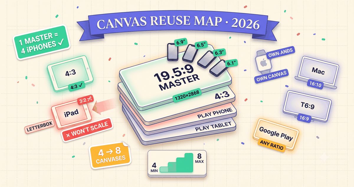
TL;DR: Aspect ratio and pixel size are two different questions. Size tells you the exact export dimensions. Ratio tells you whether one design file can scale across several device classes without cropping or letterboxing. Modern iPhones (6.9", 6.5", 6.3", 6.1") all sit within 0.5% of 19.5:9, so one 1320x2868 master covers all four. iPad splits differently: the 13", 12.9", 10.5", and 9.7" classes share a clean 4:3, but the 11" class (iPad Pro 11", iPad Air, iPad mini) is narrower at roughly 3:2 and will letterbox if you stretch a 4:3 master onto it. Watch, Mac, and TV each need their own canvas. Google Play does not enforce a fixed ratio at all.
We built a full aspect ratio reference by deriving every ratio directly from the pixel dimensions behind our screenshot sizes tool, then grouping device classes by which ones can share a template without visible distortion. This post walks through what that grouping actually means for how many templates you need to build.
Why aspect ratio is a different question from pixel size
A pixel size answer tells you what to export: 1320x2868 for an iPhone 6.9" screenshot, 2064x2752 for an iPad 13". That answer is correct and it is also incomplete, because it does not tell you whether the file you designed for one class will look right on another. Two device classes can require completely different pixel dimensions and still share the exact same shape, in which case one design scales cleanly between them. Or they can look deceptively similar in name (iPhone and iPad are both "Apple screens") and carry entirely different proportions, in which case a straight scale produces a cropped or letterboxed result.
Ratio is the shape question. Size is the export question. You need both, but ratio is the one that decides how many separate template files your design process actually requires.
iPhone: two ratio classes, not one
Every current iPhone screenshot size falls into one of two shapes. The modern class, covering the 6.9", 6.5", 6.3", and 6.1" display sizes, sits at 19.5:9 with less than half a percent of variance between them. Apple's required minimum is the 6.9" canvas at 1320x2868; the other three modern sizes scale down from that master with no visible crop.
The legacy class is a different shape entirely. The 5.5" (iPhone 8 Plus and earlier Plus models), 4.7" (iPhone SE 2nd/3rd gen, iPhone 8), and 4.0" (original iPhone SE) sizes are a flatter, exact 16:9. A design built for the 19.5:9 modern class will letterbox top and bottom if you scale it onto a 16:9 legacy size, and the reverse crops the sides. If you still support any Plus-era or SE hardware in your listing, that is a second template, not a resize.
iPhone screenshot canvases
| iPhone class | Ratio | Master canvas |
|---|---|---|
| 6.9" (required) | 19.5:9 | 1320 x 2868 |
| 6.5" / 6.3" / 6.1" | 19.5:9 | scales from 6.9" master |
| 5.5" (legacy Plus) | 16:9 | 1242 x 2208 |
| 4.7" / 4.0" (legacy SE) | 16:9 | scales from 5.5" master |
iPad: 4:3 dominates, until the 11" class breaks the pattern
Four iPad sizes, the 13", 12.9", 10.5", and 9.7", land on a clean 4:3. The required canvas is 2064x2752 for the 13" class, and the other three scale from it without cropping. This is the size most teams design for and stop.
The 11" class does not belong to that group. iPad Pro 11", iPad Air, and iPad mini sit at roughly 3:2, noticeably narrower than 4:3. Stretch a 4:3 master onto an 11" canvas and it letterboxes. If your app has meaningful iPad mini or iPad Air traffic, budget a second iPad template, not a single resize.
Watch, Mac, and TV each need their own canvas
Three more Apple platforms round out the picture, and none of them share a shape with iPhone or iPad.
Apple Watch sits around 6:5 across every case size, from 422x514 on Watch Ultra 3 down to 396x484 on the Series 9/8/7 class. That is far squarer than any phone or tablet ratio, so watch screenshots always need a dedicated template regardless of which iPhone or iPad canvas you already built.
Mac is the outlier among Apple's own platforms. It is 16:10, not 16:9, at 2880x1800. A 16:9 landscape master built for TV or Vision Pro will letterbox slightly on a Mac canvas. It is a small difference on paper and a visible one once you place both side by side.
Apple TV and Vision Pro, on the other hand, both land on standard 16:9 at 3840x2160. Two very different products, one shared landscape template.
Watch, Mac, and TV canvases
| Platform | Ratio | Canvas |
|---|---|---|
| Apple Watch (all sizes) | ~6:5 | 396 x 484 to 422 x 514 |
| Mac | 16:10 | 2880 x 1800 |
| Apple TV | 16:9 | 3840 x 2160 |
| Vision Pro | 16:9 | 3840 x 2160 (shares Apple TV canvas) |
Google Play does not enforce a fixed ratio
App Store screenshots have a small set of exact required ratios. Google Play works differently: the only hard rule is that the long side cannot exceed twice the short side. Within that constraint, the de facto standard is 1080x1920 (9:16 portrait) for phones and 1600x2560 for 7 inch and 10 inch tablets. Wear OS is the one place Play requires an exact shape, a 1:1 square at 1080x1080, matching neither the phone nor tablet canvas. Android TV lines up with the Apple TV and Vision Pro group at 16:9.
The 9:16 Play phone canvas is close enough to the legacy iPhone 16:9 group that a screenshot designed for one will read cleanly on the other, which matters if you are running a lean design process across both stores.
Repurposing a screenshot for social
Marketing teams routinely lift an App Store screenshot for a social post, and the aspect ratio math there follows the same rules as everything above. A few patterns are worth knowing before you crop:
- Instagram, TikTok, and YouTube Shorts run at 9:16, which is nearly identical to the legacy iPhone 16:9 group and the Play phone canvas. This is the easiest App Store asset to repurpose as is.
- A square feed post is 1:1. Cropping a tall 19.5:9 iPhone screenshot into a square removes a large share of the vertical content, so plan the crop rather than centering it automatically.
- Instagram and Facebook portrait feed posts run 4:5, closest in shape to the Apple Watch's ~6:5 canvas and furthest from a tall iPhone screenshot.
- A landscape YouTube or X video cover at 16:9 shares its canvas with Apple TV, Vision Pro, and Android TV screenshots, so a demo reel thumbnail can reuse that same template directly.
- None of these social ratios match the 4:3 iPad canvas, so an iPad screenshot always needs a fresh crop for social use, never a direct export.
How many templates do you actually need
Add it up and a full App Store plus Google Play listing needs at minimum four design canvases: 19.5:9 for modern iPhone, 4:3 for most iPad sizes, and one flexible canvas each for Play phone and Play tablet (which can often be the same file). Add a fifth if you support legacy iPhone or iPad 11" class devices, a sixth for Watch, and a seventh and eighth if you ship Mac and TV or Vision Pro screenshots. That is a wide range, from four templates for a phone-only Play and modern-iPhone-only listing, up to eight for a developer supporting every Apple platform plus Android.
The full reference lists every class with its exact ratio, its CSS aspect-ratio value for prototyping, and which other classes it groups with, so you can check your own canvas count against your actual device support list rather than guessing from memory. It pairs with our screenshot sizes guide for the exact export pixels once you know which canvases you need, and with our annotation design playbook for how callout placement changes once the canvas shape does.
Frequently asked
What aspect ratio should I design App Store screenshots at?
Design iPhone at 19.5:9 using the 1320x2868 canvas. It is the required base and Apple scales it down to every other iPhone class with no visible crop. Design iPad at 4:3 using the 2064x2752 canvas. These are two separate canvases; stretching one to fit the other will crop or letterbox.
Is the iPhone screenshot aspect ratio the same on every model?
No, but it clusters into two groups. Modern iPhones (6.9", 6.5", 6.3", 6.1") are all within half a percent of 19.5:9. Plus-era and legacy iPhones (5.5", 4.7", 4.0") are a squarer, exact 16:9. Scaling one template across both groups will letterbox on whichever group the template was not built for.
What aspect ratio does Google Play require?
There is no single required ratio. The only rule is that the long side must be at most twice the short side. The de facto canvas most listings use is 1080x1920 (9:16 portrait) or 1920x1080 (16:9 landscape), and Wear OS is the exception at a required 1:1 square.
Can I reuse one screenshot template across iPhone, iPad, and Mac?
Not directly. iPhone is roughly 19.5:9, iPad is 4:3, and Mac is 16:10, three distinct shapes. Apple TV and Vision Pro do share one 16:9 landscape canvas with each other and with Android TV, so that group is reusable across those three specifically.
What aspect ratio should I use when cropping an App Store screenshot for Instagram or TikTok?
For Stories, Reels, and TikTok, use 9:16. It is nearly identical to the legacy iPhone 16:9 group, making it the easiest App Store asset to repurpose as is. For a square feed post, use 1:1 and expect to crop a significant amount of content from a tall iPhone screenshot.