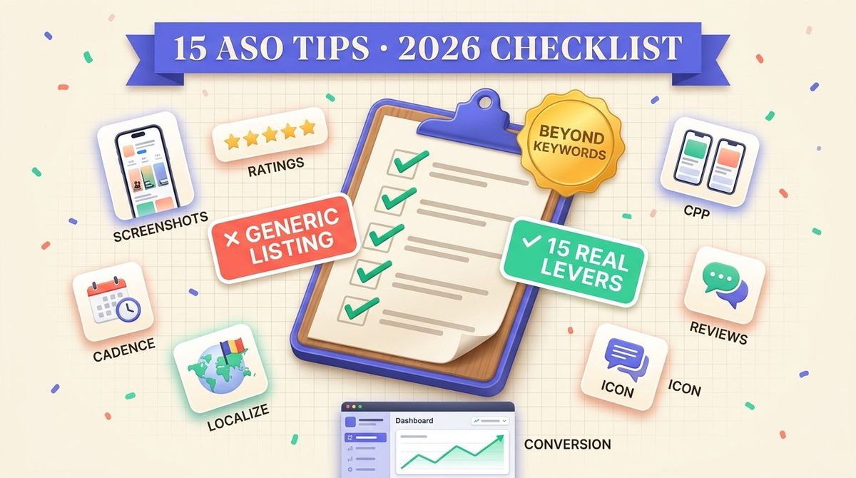
Keyword optimization decides whether your app shows up in a search. It does not decide whether the person who finds it taps install. That second decision runs on a different set of levers: the screenshots in the carousel, the star rating next to your icon, how recently you shipped an update, whether your listing reads like it was translated or written for the reader, and whether every visitor lands on the same generic page regardless of how they got there. This post covers 18 concrete ASO tips that sit outside keyword strategy. For the keyword side, see our guide to ASO keyword optimization strategies. Everything below assumes your keywords are already doing their job and focuses on what happens after a user lands on your page.
Screenshots and creative testing
Screenshots are the first thing most visitors actually look at, before they read a word of your description. A carousel that leads with a plain feature list loses people who are deciding in seconds, not reading a spec sheet. Lead with the outcome the app delivers, not a UI screenshot with a caption bolted on. If your first frame requires explanation, it is not doing its job.
Test one variable at a time. Apple's Custom Product Pages and Google Play's store listing experiments both let you run a screenshot set against a control, but a test that changes the headline, the order, and the background color at once cannot tell you which change moved the number. Change one frame, run it long enough to clear a reasonable sample, then move to the next variable.
Device frame accuracy matters more than most teams assume. A screenshot that shows the wrong device silhouette for the store it is submitted to reads as generic stock art rather than your actual product. Check exact pixel dimensions per device class before you export, our screenshot size reference covers the current spec for every required size on both stores.
The icon and the first screenshot do different jobs and get tested differently. The icon has to work at a tiny size next to a dozen competitors in a search grid, so legibility at 60 pixels matters more than detail. The first screenshot has the whole width of the device to work with and gets seen after the tap already happened once, in the app switcher or a shared link. Testing them together in one experiment makes it hard to know which one moved the number when a result changes.
Preview videos are worth the production time only if the first three seconds hold up on their own. Autoplay is silent on both stores by default, so a video that opens on a talking head or a logo animation loses most of its potential audience before the sound would have mattered anyway. Open on the same outcome-first frame you use for your lead screenshot, then use the extra seconds a screenshot cannot give you: a real interaction, not a montage of feature callouts.
A test result is only real once it clears a minimum sample size. Calling a winner because one variant is ahead after a few hundred visitors is how noise gets promoted to a decision. Our A/B test sample size calculator takes your baseline conversion rate and the effect size you care about and returns the visitor count each variant needs before the gap means anything. Run it before the test starts, not after you already like the number.
Screenshot caption text as a discoverability signal, not conversion
Every tip above treats screenshots as a conversion lever: something a visitor sees after they already found your listing. There is a separate, less settled question. Apple's on-device text recognition is mature enough to read words baked into an image, and a growing number of ASO practitioners report that caption text inside screenshots appears to influence what your app is found for, not only whether a visitor installs it. Apple has not confirmed this as a ranking factor. We cover what is confirmed and what is not in our screenshot text indexing deep dive.
The practical takeaway holds either way. Write screenshot captions the way you would write a keyword field entry, specific words a searcher would actually type, not a generic tagline, and localize those words per market instead of leaving the English caption in place. If the signal turns out to be real, that work already pays off. If it does not, you still get the conversion benefit the first section above covers.
Ratings and review response
Both stores treat ratings as a ranking and conversion signal, and both give you a native prompt to ask for one. Apple's StoreKit review prompt is rate limited by the system itself, historically capped at three prompts per app per 365 days regardless of how many times your code calls it, so timing the call matters more than calling it often. Trigger it after a moment of clear success, not on first launch or right after a crash.
Google's In-App Review API works differently. Google does not publish an exact display quota, and the API itself decides whether to show the prompt on any given call. Treat it the same way: call it after a positive moment, and do not assume every call results in a visible prompt.
Responding to reviews is the part most indie teams skip, and it is free. A short, specific reply to a negative review, especially one that names a fix and a timeline, is visible to every future reader of that review, not just the original poster. It will not undo a low star rating, but it changes what a prospective user reads directly underneath it.
Response speed matters for the same reason it matters in support tickets: a review that got a reply within a day reads as an active team, and a review that sat unanswered for a year reads as an abandoned one, even if both apps are equally maintained under the hood. If you cannot answer every review, prioritize the ones with a specific, fixable complaint over the ones that are just a low score with no text. Those are the replies most likely to be read by the next visitor who scrolls past that exact complaint.
Release cadence as a freshness signal
Neither store publishes an exact algorithm for how update recency affects ranking. What is documented and testable is more indirect: both stores surface "recently updated" filtering and sorting in some browse contexts, and a stale changelog is a visible signal to any user who checks it before installing. An app that last shipped eight months ago reads as unmaintained even if it works fine.
A cadence you can sustain beats a burst you cannot. Shipping every two weeks for a month and then going quiet for a quarter is worse for this signal than a boring, predictable monthly release with a changelog that says something real. "Bug fixes and performance improvements" on every entry tells a reader nothing and reads the same as no changelog at all.
Small releases count. A cadence signal comes from the date on the last update, not the size of the diff. A one-line copy fix shipped this week is a more current signal than a major rewrite that shipped six months ago, so there is no reason to hold a ready fix back just because it feels too small to count as a release.
In-app events and time-boxed listing content
Apple's In-App Events surface a live challenge, a limited sale, a new season, or a competition directly in Search and the Today tab, with its own card, its own image, and a start and end date you set. The event expires on its own. That expiry is the useful part: it forces a cadence of listing updates that a changelog alone cannot, because an event that already ended and is still showing looks broken rather than stale.
Google Play does not have a named equivalent, but the mechanism carries over. Seasonal promotional graphics, limited-time store listing copy, and time-boxed store listing experiments all work the same way: they read as current while they run and need a firm end date so nobody has to remember to take them down.
Treat an event or seasonal push as a scheduled task with a start and an end, not a one-time asset. Build the event image and copy at the same time as the feature it promotes, not after launch when the moment has already passed and the update reads as an afterthought.
App description copy for readers who scroll past the fold
Most visitors never read the full description, but the ones who do are further along in deciding, and the copy either closes that decision or loses it. The first two lines carry the most weight because they show before a "more" tap on both stores. Lead with the specific problem the app solves and who it solves it for, not a list of every feature it happens to have.
Write for the reader who is already convinced enough to keep reading, not the reader who bounced at the screenshots. That means concrete detail: what data it needs, what it costs, what happens after the free tier ends, rather than restating the value proposition a second time in different words. A description that repeats the headline in paragraph form wastes the one part of the listing built for depth.
Localization as a conversion lever, not a translation checkbox
A machine translated listing reads as machine translated to a native speaker in the first sentence, and that impression costs you the tap before your screenshots even get a chance. Localization done for ASO means the headline, the screenshot copy, and the description are written for that market, not translated word for word from the English source. We cover the layout side of this in detail, including which languages need extra room and which need less, in our text expansion data across all 41 locales.
Prioritize by opportunity, not by the number of countries a language covers. A market where you already have organic traffic and no localized listing is a faster win than a market you have never touched. Check your existing analytics by country before you decide which language to localize next.
Localized screenshots need the same layout discipline as the description. A headline that fit in two lines in English can wrap to three in German or overflow a button in Polish, which is a design problem, not a translation problem. Right-to-left languages mirror the whole layout, not just the text direction, and CJK scripts usually need less horizontal room but more attention to font weight at small sizes. Plan the worst case into your template instead of discovering it locale by locale after submission.
Custom Product Pages for segment-specific conversion
A single generic product page has to work for every visitor, whether they arrived from a broad keyword, a paid campaign, or a link in a review article. Custom Product Pages let you build a variant tuned to a specific audience and route traffic to it, so a user who clicked a "budget tracking" ad sees screenshots about budget tracking, not your full feature set. We cover how many variants are worth building, and when adding a fifth one stops paying for itself, in our CPP variant count guide.
Match the variant to the traffic source, not to an internal feature you want to promote. The most common mistake here is building variants around what the team is proud of shipping rather than around what each traffic segment actually searched for or clicked on to get there.
Submit for Editorial Consideration
Both stores run editorial programs that ranking and conversion levers alone cannot reach. Apple's App Store Connect includes a nomination form under each app record, where you can flag an in-app event, a major update, or a seasonal moment for the editorial team to consider for the Today tab, a category story, or a featured collection. It is not guaranteed placement, and Apple does not publish acceptance rates, but the form takes minutes and costs nothing to submit.
Google Play does not offer a public nomination form. Editorial placement there runs through developer programs that open and close on their own schedule, tied to a season or a platform moment. Watch the Play Console news feed and the Android Developers blog for open calls, and apply promptly when one matches your app, since these windows do not stay open long.
Treat a nomination the same way you treat an in-app event: tied to something real and time-boxed, not a generic request to be featured. A submission that points to a specific, dated event or update gives an editor something concrete to evaluate.
Where iOS and Android tips diverge
Most of what moves conversion works the same on both stores, but three levers behave differently enough that copying one store's playbook onto the other wastes effort: how much control you get over the rating prompt, how page experiments are structured, and how many variants each platform lets you run at once.
| Lever | App Store (iOS) | Google Play |
|---|---|---|
| Rating prompt cap | Around 3 per year, system-enforced | No published cap, API decides per call |
| Page experiment tool | Custom Product Pages | Store listing experiments |
| Max variants | 35 | 5 |
The practical effect: a five-variant Play test plan copied onto the App Store leaves 30 Custom Product Page slots unused. A 35-variant App Store plan copied onto Play cannot run at all. Build the testing calendar per store, not once and reuse.
Where to focus first
| Lever | Effort | Signal it moves |
|---|---|---|
| Screenshot lead frame | Low | Tap-through from search results |
| Review response | Low | Trust for readers of existing reviews |
| Rating prompt timing | Low | Average star rating |
| Changelog quality | Low | Perceived maintenance, install confidence |
| In-app event or seasonal push | Medium | Visibility in Search and Today/browse tabs |
| Localized listing copy | Medium | Conversion in that market |
| Custom Product Page variant | Medium | Conversion by traffic source |
| Editorial nomination | Low | Featured placement odds, no ranking guarantee |
| Release cadence | High | Freshness over months, not one release |
| Screenshot caption keywords | Low | Emerging discoverability signal, unconfirmed |
The 18-tip checklist
- Lead your screenshot carousel with the outcome, not a labeled UI panel.
- Test one screenshot variable at a time, not a full redesign against a control.
- Match device frame and pixel dimensions exactly to each store's current spec.
- Trigger the native rating prompt after a clear moment of success, not on first launch.
- Expect Apple's system prompt to be rate limited regardless of how often your code calls it.
- Do not assume every call to Google's In-App Review API shows a visible prompt.
- Reply to negative reviews with a specific fix and timeline, not a generic apology.
- Keep a changelog readers can act on, skip the generic "bug fixes" entry.
- Ship on a cadence you can sustain for a year, not a burst you cannot repeat.
- Give an in-app event or seasonal push a firm end date, and take it down on schedule.
- Localize copy for the market, do not machine translate the English source.
- Prioritize localization by where you already have organic traffic, not by country count.
- Build Custom Product Page variants around traffic sources, not internal feature pride.
- Route paid and referral traffic to the variant that matches what they clicked on.
- Check analytics by country before committing engineering time to a new locale.
- Submit real events and major updates through App Store Connect's editorial nomination form, and watch for Google Play's own open feature programs.
- Write screenshot captions like keyword field entries, specific words a searcher would type, and localize them per market.
- Revisit this list quarterly. What moved the needle last year will not stay constant.
FAQ
What is the difference between ASO tips and ASO strategy?
ASO strategy usually refers to the keyword layer: title, subtitle, and keyword field decisions that determine what your app is found for. ASO tips in this post cover the conversion layer: what happens after a user finds your listing, including screenshots, ratings, release cadence, localization, and Custom Product Pages.
How often should indie developers update their app for ASO?
Neither Apple nor Google publishes an exact cadence requirement. A predictable monthly release with a real changelog performs better for the freshness signal than an irregular burst of updates followed by months of silence.
Does responding to app store reviews actually help ASO?
It does not change your star rating directly, but a specific, helpful reply is visible to every future reader of that review. It is one of the few ASO levers that costs nothing but time.
Are Custom Product Pages worth building for a small indie app?
They are worth building once you have at least one identifiable traffic segment, such as a paid campaign or a recurring referral source, that would benefit from screenshots tuned to what brought them there. Building variants with no distinct traffic source to route just adds maintenance.
Are Apple's In-App Events worth the setup work for a small team?
They are worth it for anything genuinely time-boxed: a seasonal feature, a limited challenge, a real sale. The card gives you extra placement in Search and the Today tab for the length of the event. They are not worth building for a feature that never actually ends, since a listing update without an expiry date does the same job with less overhead.
Do ASO tips differ between iOS and Android?
The goal is the same on both stores: convert someone who already found your listing. The mechanics differ. Apple caps the native rating prompt at roughly three per year and allows up to 35 Custom Product Page variants. Google Play publishes no rating prompt cap and limits store listing experiments to 5 variants.
Does screenshot caption text affect App Store search rankings?
It is not confirmed. Apple has not published screenshot text as a ranking factor, but its on-device text recognition can read words inside images, and practitioner reports describe a discoverability effect. Writing specific, localized captions costs nothing extra and helps conversion regardless of whether the ranking effect is real.
Is it worth submitting an app for Apple's editorial consideration?
Yes, when the submission points to something concrete and dated, such as an in-app event or a real update, since the form takes minutes and carries no downside. Google Play does not offer an equivalent nomination form. Watch for its own open feature programs instead.
How many keywords should I use in my App Store title, subtitle, and keyword field?
There is no fixed keyword count. The constraint is character space: Apple gives you 30 characters for the title, 30 for the subtitle, and a shared 100-character keyword field, and every character left unused is a term you could have ranked for instead. Paste your current fields into our keyword field counter to see the exact count against each limit, plus duplicate and overlap terms it flags automatically.