Japanese App Store Screenshots: Why Direct Translation From English Doesn't Work
Localizing your app for Japan? If you just ran your English screenshot text through Google Translate, swapped the strings, and shipped it, your japanese app store screenshots are almost certainly broken in ways you cannot see from outside Japan. Wrong fonts. Suffocating line height. English punctuation embedded in Japanese sentences. Tech-app text that switches typeface mid-word.
This is the second post in our typography-and-localization data series. The German companion post showed how German expands (longer strings, more vertical space). Japanese does the opposite. It compresses the character count but increases visual density per character. Both languages break naive English layouts, just from opposite directions.
The TL;DR
Japanese app store screenshots fail when designers treat them as translated English. Japanese characters occupy roughly the same horizontal width as English (fewer characters, but each is about 2x wider), so the text block looks similar in size but becomes visually denser. Without increasing line height from 1.4 to around 1.7, switching to a CJK-aware font like Noto Sans CJK JP or Hiragino Sans, and replacing English punctuation with 「」、。, the screenshots read as machine-translated and unprofessional to Japanese users.
Japanese App Store Screenshots Aren't Just "Translated English"
The most common mistake is assuming Japanese is a 1:1 string swap. It is not. Japanese is a different visual system with three scripts (hiragana, katakana, kanji) often mixed in a single phrase.
Let's look at character math:
- English
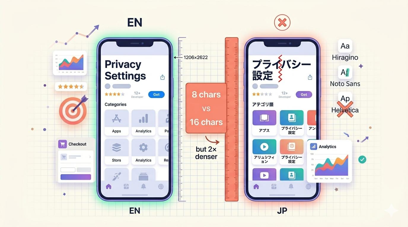
Privacy Settingsis 16 characters of narrow Latin letters. - Japanese
プライバシー設定is 8 characters, but each glyph is roughly 2x the visual width of a Latin letter. - Net horizontal width: almost identical.
- Net visual density: dramatically higher in Japanese.
That density is the trap. Designers see the Japanese string fits the same bounding box as the English string, declare victory, and move on. But the eye reads it as a wall of text, especially at the small sizes used in App Store screenshot captions.
The flip from German is striking. German blows past English string lengths by 30-40 percent and forces you to redesign layouts vertically. Japanese fits in the same horizontal space but forces you to redesign typography, not layout.
The Font Fallback Trap
This is the single biggest visible failure in shipped japanese app store screenshots: a visible font seam in the middle of mixed Latin and Japanese text.
Here is what happens. You designed your screenshots in Figma with Helvetica or SF Pro. The Japanese characters in your localized strings do not exist in those Latin-only fonts. iOS silently falls back to the system Japanese font (Hiragino Sans or Hiragino Mincho). The result: a sentence like Pro版で全機能を解放 renders Pro in SF Pro and the kanji in Hiragino. The stroke weights do not match. The vertical alignment shifts. The character spacing breaks.
To a Japanese user, this looks exactly as amateurish as a Times New Roman headline followed by Comic Sans body copy would look to a Western user.
The Fix
Use a font family that covers both Latin and CJK in a coherent design:
- Noto Sans CJK JP from Google. Free, open source, designed specifically to harmonize with Latin Noto Sans.
- Source Han Sans from Adobe. Same font, different name, same family as Noto.
- Hiragino Sans. iOS system default, but only available in Apple's design tools by default.
Pick one and use it for both the Latin and Japanese parts of every screenshot string. No fallbacks, no mixed families.
Line Height: The 1.4 vs 1.7 Rule
English screenshot captions typically use a line height between 1.2 and 1.4. Japanese needs 1.6 to 1.8. This is not a stylistic preference, it is a legibility requirement.
Kanji characters are visually heavy. A typical kanji has 8 to 15 strokes packed into a square. Stack two lines of kanji at line height 1.3 and the top strokes of the lower line almost collide with the bottom strokes of the upper line. The reader's eye cannot find the line break.
Bump line height to 1.7 and the same text breathes. The information density per pixel stays high (Japanese users prefer that, as we will see), but the reading rhythm becomes natural.
If you reuse your English line height value in your Japanese export, your screenshots will look suffocated. This is one of the fastest ways to identify a machine-localized app listing.
Common Words That Look Wrong
This table is the heart of the post. Pin it, screenshot it, share it on Twitter.
| English | Japanese | Char count | Visual issue |
|---|---|---|---|
| Settings | 設定 | 8 → 2 | Tiny text block. Looks underweight next to icon. Increase font size 10-20%. |
| Notifications | 通知 | 13 → 2 | Same problem. Two kanji feel lost in space designed for 13 Latin chars. |
| Save time | 時間を節約 | 9 → 5 | Fewer chars, similar width, much denser. Needs line height 1.7+. |
| Get started | 始めましょう | 11 → 6 | Polite form is long. Common CTA failure. Test 始める (3 chars) for tighter spaces. |
| Download | ダウンロード | 8 → 6 | Katakana loanword. Same visual length, but uses different script than the rest of your UI. |
| Privacy Settings | プライバシー設定 | 16 → 8 | Mixes katakana and kanji. Width identical. Density doubled. |
| "Try it free" | 「無料で試す」 | 13 → 7 | Note 「」 instead of "". Using English quotes here is the most common amateur tell. |
The pattern: Japanese almost always has fewer characters but rarely takes less horizontal space, and always takes more visual attention per character.
Punctuation Is Not Optional
Three small swaps separate professional from amateur:
- Quotes: 「 」 not " "
- Comma: 、 not ,
- Period: 。 not .
A sentence like "設定" を開く. screams machine translation. 「設定」を開く。 reads as native. The visual spacing of the punctuation is also designed to sit correctly with full-width characters, where English punctuation looks cramped.
How to Design Japanese App Store Screenshots Right
A checklist, in priority order:
- Pick one CJK-compatible font family (Noto Sans CJK JP or Source Han Sans) and use it for all text on the screenshot, Latin and Japanese.
- Set line height to 1.6-1.8, not 1.2-1.4. Multi-line headlines are the most common failure point.
- Resize per-string, not globally. Short strings like 設定 and 通知 often need to scale up 10-20% to maintain visual weight. Long strings stay the same.
- Use Japanese punctuation in every string. No exceptions.
- Embrace density. Japanese App Store listings tolerate (and culturally prefer) more information per screen than US listings. Apple's own Japanese App Store description uses a smaller font for descriptions than the English version.
- Test mixed strings carefully. Anything like
iPhone対応orPro版is a font seam risk. Render at final size and inspect. - Read about layout direction for any vertical text or furigana (small reading aids above kanji). Most screenshots stay horizontal, but if you use vertical script you need a font that supports it.
If you are running localization for multiple markets, the broader principles are covered in our localization hub. Japan is rarely the only market where direct translation fails. Compare with German vertical expansion and you have most of the world's typography traps in two posts.
Tools and Fonts You Should Use
The minimum viable toolkit for shipping localized japanese app store screenshots:
- Font: Noto Sans CJK JP for body, optional Noto Serif JP for headlines.
- Reference: Apple's Human Interface Guidelines on typography includes Japanese-specific guidance.
- Text expansion check: our text expansion calculator for sanity-checking string lengths before you commit to a layout.
- Visual reference: Download three top Japanese apps from the Japan App Store (LINE, メルカリ, ヤフー) and inspect their screenshot typography. The patterns repeat.
- ASO basics: if you are early in your localization journey, start with our ASO pillar.
- Mistake-avoidance: our list of app store screenshot mistakes catches several of these issues at the design stage.
FAQ
Do I need a Japanese designer to ship Japanese App Store screenshots?
Not strictly, but you need a Japanese-fluent reviewer. The typography rules above get you 80 percent of the way. The remaining 20 percent (natural phrasing, polite-form choice, brand voice) requires native review. Shipping without that review is the most common avoidable failure.
Can I use the same font sizes as my English screenshots?
For most strings, yes, if you also increase line height to 1.6-1.8. For very short strings like 設定 (2 chars) or 通知 (2 chars), scale up 10-20 percent so the text holds visual weight against icons and imagery. Reusing English sizing without adjusting line height is the single fastest way to make Japanese screenshots look suffocated.
Is Hiragino better than Noto Sans CJK JP?
For on-device iOS rendering, Hiragino is the system default and what users see everywhere else in the OS. For App Store screenshots that you design in Figma or Sketch, Noto Sans CJK JP is free, harmonizes with Latin Noto Sans, and looks consistent across export pipelines. Both are excellent. Pick one and stick with it across every screenshot in the same listing.
Ship Japanese Screenshots That Actually Convert
Direct translation gets you broken japanese app store screenshots. Correct typography gets you screenshots that look native, build trust, and convert. The difference is one font swap, one line-height adjustment, and three punctuation marks.
If you want a faster path: Shotlingo handles font fallback, line height, and CJK punctuation automatically when you localize a screenshot from English into Japanese. Create a free account and try localizing one screenshot. You will see the seam-free render in under a minute.