Education App Screenshot Templates
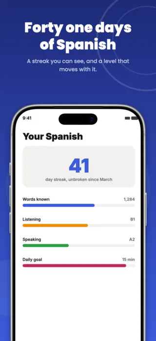
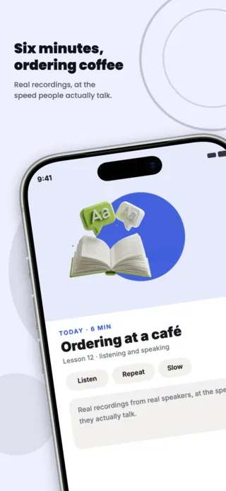
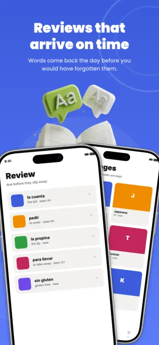
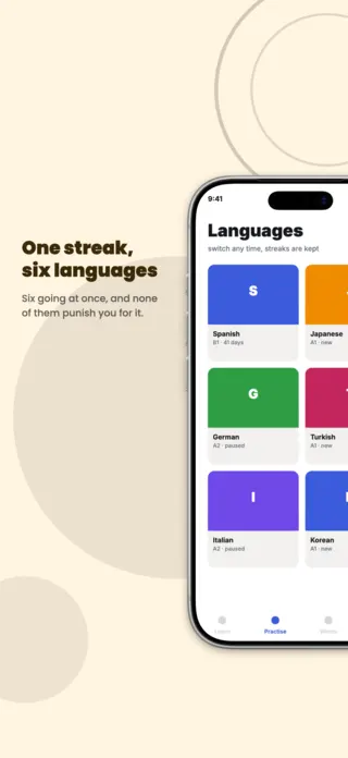
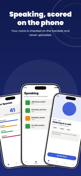
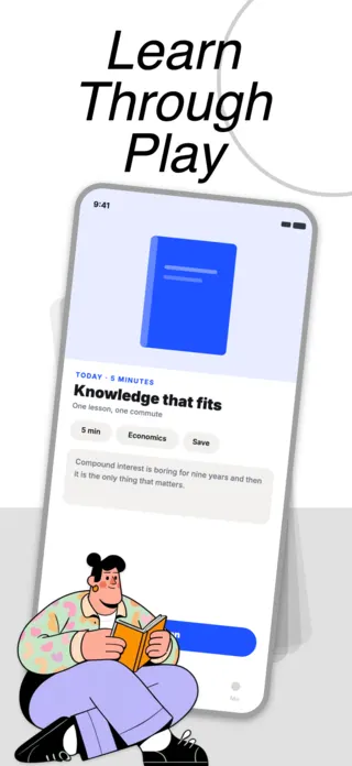
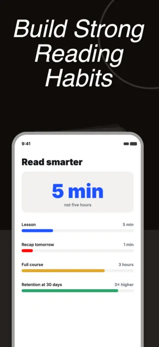
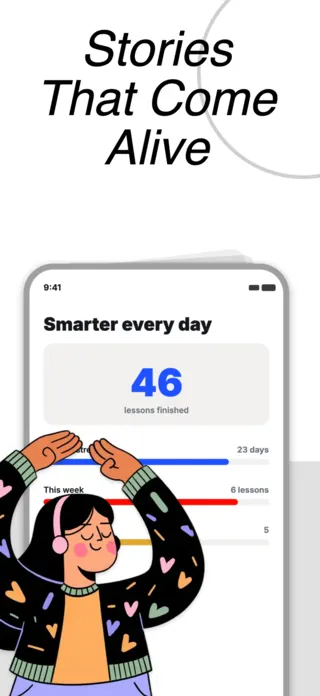
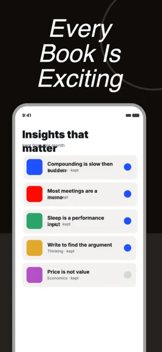
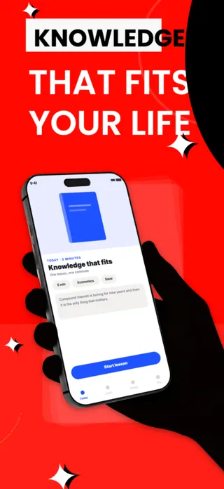
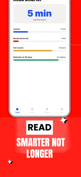
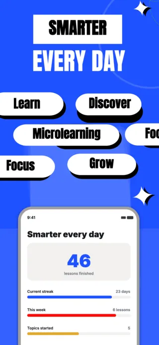
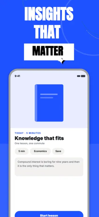
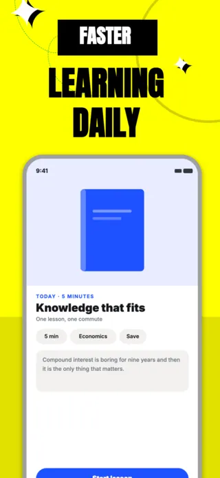
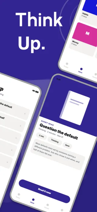
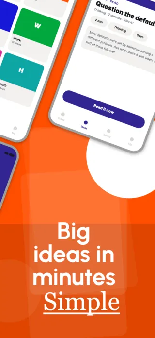
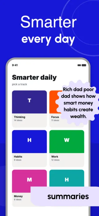
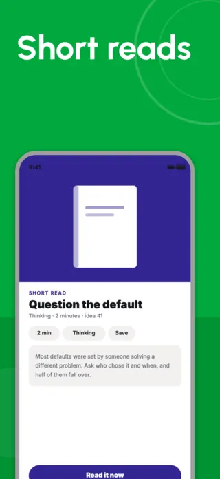
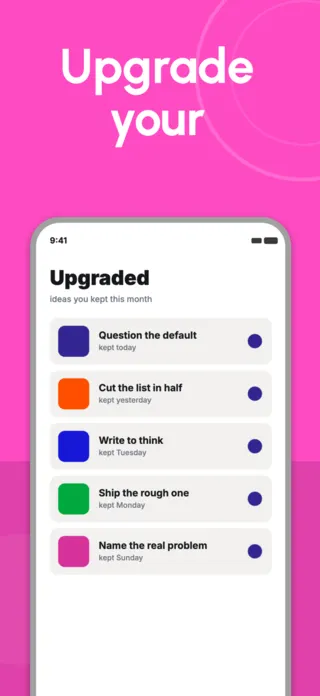
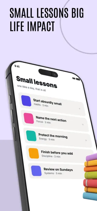
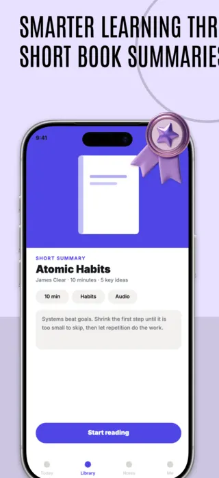
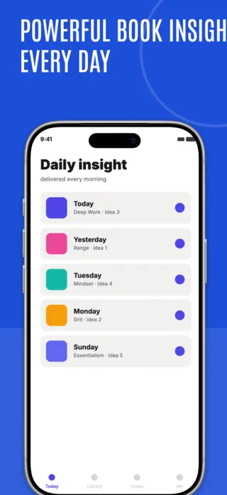
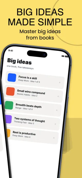
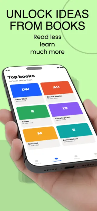
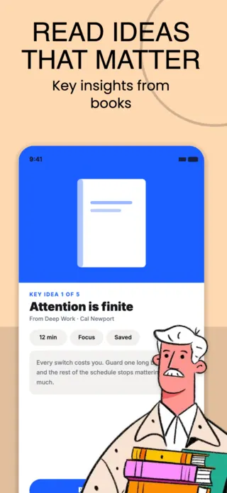
Learning apps are bought on the promise of a habit, and habits are hard to photograph. The screenshots that work show the smallest unit of the product (one card, one summary, one five-minute lesson) because that is what makes the promise feel achievable. A course catalogue makes it feel like homework.
6 education & learning templates

What the first screenshot has to do
Show one lesson at actual size, mid-progress. The specific card the user will read on their first session is more persuasive than the number of cards available, and "3,000 titles" is a claim you then have to keep true.
What gets education & learning listings rejected or ignored
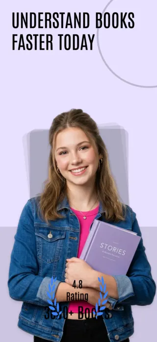
- Book covers, author photographs and publisher marks used without licence, the defining rejection risk of the book-summary niche.
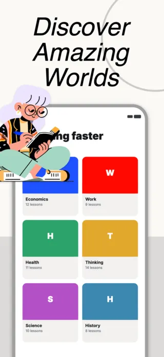
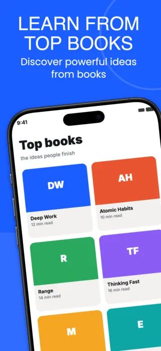
- Catalogue counts and library-size claims baked into the image, which become false the moment the catalogue changes.
- Quiz and flashcard screens shown at a density that is illegible below full size.
- Certification and accreditation implications the app cannot actually deliver.
Localising these screenshots
Educational copy is the longest-form text in any of these categories, and it expands hardest: German runs substantially longer than English, and a summary card laid out tight to the English string will overflow. Give body text a generous line budget before translation rather than shrinking the type after it.
Every template here exports at 1290×2796 for App Store Connect and translates into 40+ languages in one pass. If you are unsure which locales your listing actually needs, the App Store locale code reference lists every one Apple supports, and the text expansion calculator shows how far each language will stretch your headline before you commit to a layout.
Templates for other app categories
Start from one of these
Open any template in the editor, swap the copy and screenshots for your own app, then translate the whole set into every locale your listing targets.
Open the editor →